Predictive Machine Maintainence
Introduction
Problem Statement:
At times, large machines which run 24*7 throught the year tend to fail. And these failures come along with some sign which can be identified and prevented from happening. Data about a machine’s run can be collected from various sources and tracked over a period of time so detect these failures. Let us come up with one such approach to predict when a model fails.
About the data:
We have been given a set of files. Each file has information about a particular machine. What is this information? Let’s find out. For every 8 hours, data from 4 different sources representing a machine’s state is captured i.e. 3 entries per day. A history total of 2 years 9 months is captured. This gives us a reading of 3000 rows per machine. We have such data from 20 machines.
Modes of a machine:
Each machine has three modes.
- Normal mode : Usually a machine will be in this mode when it starts
- Faulty mode : When a machine is about to fail, it shows a visible pattern which indicates faults in the machine. This is where our method should inform officials that machine is likely going to fail
- Failed mode : When a machine fails to run and halts, it is said to be in failed mode, incurring huge losses to the company
Aim:
Detect when a machine enters Faulty mode and raise an alarm.
Solution:
Couple of steps before we head to find the solution. Our data needs to be cleansed and made ready for computation. Let us split the solution into multiple stages.
- Data Cleansing
- Data Analysis
- Data Transformations
- Computational Inference (Prediction)
Let us go ahead and implement each stage in a modular fashion.
# Import all necessary libraries in this cell
from IPython.display import display
import pandas as pd
import matplotlib.pyplot as plt
%matplotlib inline
import matplotlib as mpl
from scipy import stats
import glob
import numpy as np
mpl.style.use('seaborn-darkgrid')
palette = plt.get_cmap('Set1')
Stage 1: Data Cleansing
Here, we load each file as a dataframe, look at a subset of the data, understand its structure, check for missing values or nan’s and finally fill in missing values with standard techniques like mean, median depending on inputs from domain experts. Basically get the look and feel of the data.
PS: For demonstrating purposes let us stick to single csv file
data_path = '/Users/badgod/badgod_documents/Datasets/tagup_challenge/exampleco_data/'
data = pd.read_csv(f'{data_path}/machine_7.csv',index_col=0)
data.head()
| Col 0 | Col 1 | Col 2 | Col 3 |
|---|---|---|---|
| 12.60 | 8.82 | -11.77 | 10.07 |
| 10.82 | 2.77 | 11.55 | 21.89 |
| 21.07 | -0.66 | -17.83 | -1.35 |
| 32.29 | 6.53 | -13.49 | -4.25 |
| 28.06 | 3.70 | 21.98 | 13.63 |
Data has 5 columns in total. First column is the timestep and rest of the 4 columns are the features indicating a machine’s health
data.describe()
| Col 0 | Col 1 | Col 2 | Col 3 | |
|---|---|---|---|---|
| count | 3000.00 | 3000.00 | 3000.00 | 3000.00 |
| mean | -0.40 | -0.10 | 0.30 | 1.93 |
| std | 61.01 | 55.69 | 57.53 | 57.77 |
| min | -319.99 | -269.28 | -292.44 | -275.33 |
| 25% | -0.46 | -0.24 | -1.15 | -0.02 |
| 50% | -0.00 | -0.00 | -0.00 | 0.00 |
| 75% | 1.19 | 0.13 | 0.35 | 0.76 |
| max | 310.72 | 263.39 | 285.20 | 359.93 |
Each feature has 3000 timesteps. Now that we understand the structure of our data let us head to data cleansing
Missing value treatment
data.isnull().sum()
Col 0 - 0
Col 1 - 0
Col 2 - 0
Col 3 - 0
dtype: int64
As we see, all four columns have no missing values. Let us read all the dataframes into memory and cleanse data
def fix_missing_values(df):
    """
    Method accepts a pandas dataframe, checks for nan's or missing values and replace them with column median.
    More sophisticated methods replacement methods can also be incorporated in future.
    :param df: a pandas dataframe
    :return: dataframe without nans
    """
    if df.isnull().sum().sum() !=0:
        return df.fillna(df.median())
    else:
        return df
files = glob.glob(f"{data_path}/*")
dfs = []
if len(files)>0:
    for file in files:
        df = pd.read_csv(file, index_col=0)
        dfs.append(df)
else:
    raise Expection(f"Data files not found in path {data_path}")
"Total number of dataframes in memory ",len(dfs)
('Total number of dataframes in memory ', 20)
Let us head straight to the next stage in our pipeline, data transformations
PS: Please keep in mind ‘data’ is a single dataframe on which we test our methods. We then appy these methods on entire dataset ‘dfs’
Stage 2 & 3: Data Analysis & Transformations
Here in this section, we will conduct thorough exploratory analysis on the data and carry out required transformations to make data suitable for computational inference.
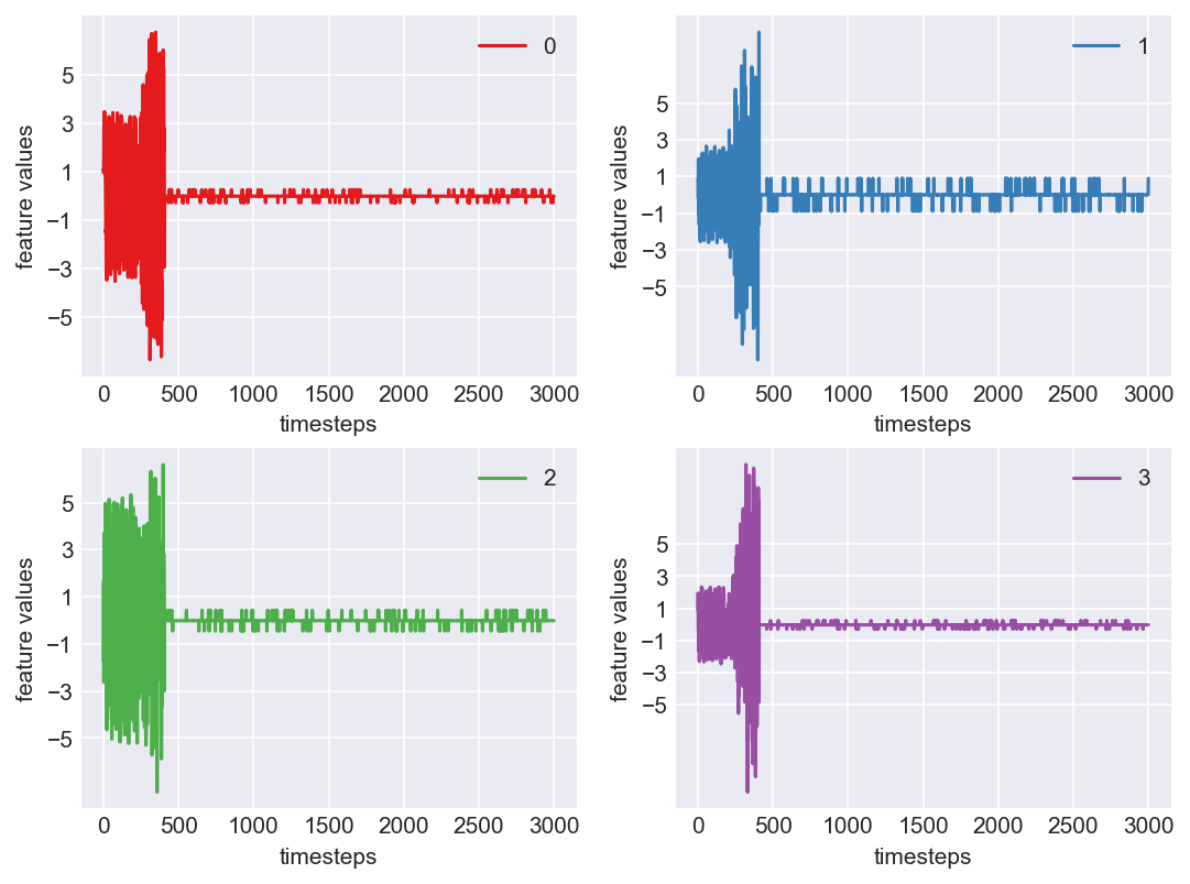
Let us plot all the features vs timesteps (features on y-axis; timesteps on x-axis)
mpl.rcParams['figure.dpi'] = 150
plt.plot(range(len(data)), data)
plt.xlabel('timesteps')
plt.ylabel('feature values')
plt.show()
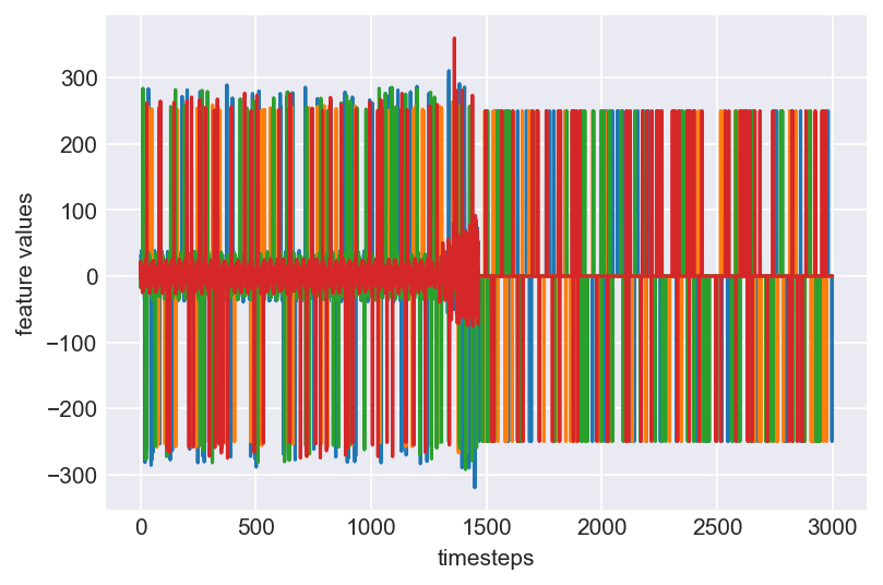
Clearly, this plot does not give us any clear information about the underlying behaviour of a machine, which the four variables capture. Let us print some statistics about the data and understand them clearly.
data.describe()
| Col 0 | Col 1 | Col 2 | Col 3 | |
|---|---|---|---|---|
| count | 3000.00 | 3000.00 | 3000.00 | 3000.00 |
| mean | -0.40 | -0.10 | 0.30 | 1.93 |
| std | 61.01 | 55.69 | 57.53 | 57.77 |
| min | -319.99 | -269.28 | -292.44 | -275.33 |
| 25% | -0.46 | -0.24 | -1.15 | -0.02 |
| 50% | -0.00 | -0.00 | -0.00 | 0.00 |
| 75% | 1.19 | 0.13 | 0.35 | 0.76 |
| max | 310.72 | 263.39 | 285.20 | 359.93 |
Looking at the standard deviation and the range of data, we see some vairance in the data. Clearly it is less suitable for any predictive modelling and needs transformations like outlier treatment, data normalization, skew removal etc.
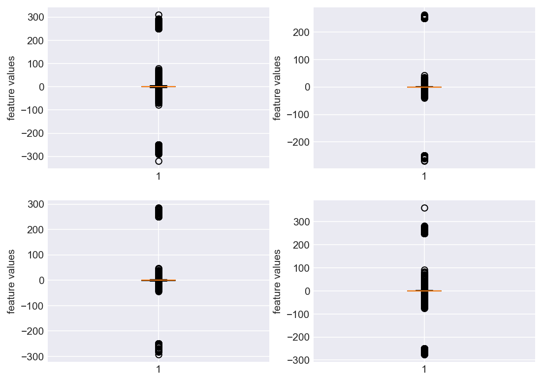
Let us go ahead and check if the data has any outliers (Need to be very careful when calling data point an outlier. Domain expertise needs to be strictly considered).
plt.subplots_adjust(bottom=0.3, top=1.5, left=0.4, right=1.5)
for i in range(len(data.columns)):
    plt.subplot(2,2,i+1)
    plt.boxplot(data[str(i)])
    plt.ylabel('feature values')
plt.show()
plt.subplots_adjust(bottom=0.3, top=1.5, left=0.4, right=1.5)
for i in range(len(data.columns)):
    plt.subplot(2,2,i+1)
    plt.scatter(range(len(data)),data[str(i)], color=palette(i), label="feaure_"+str(i))
    plt.xlabel('timesteps')
    plt.ylabel('feature values')
    plt.legend(loc=1)
plt.show()
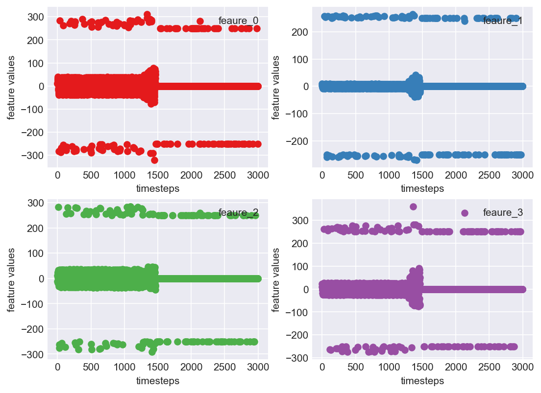
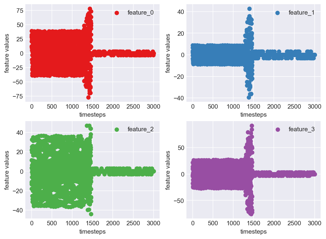
Clearly, this is not a pretty sight. For all the four features, there are few data points which are above 200 and below -200. This can be due to multiple reasons. May be from measurement errors, or from power variations in the machine environment etc. Based on domain expertise, let us consider them as outliers for now, and ofcourse treat them.
Outlier treatment
Let us consider two methods for outlier removal process.
- Z-score
- Inter Quartile Range
After visualizing the results of each process we will decide which method to pick
1. Z-score
Let us use a method called Z-score to identify and remove outliers. Z-score says how many standard deviations is a given data point devaiating from the mean. Z-score centers the data around zero mean and unit variance. Usually a threshold of 3 standard deviations is allowed in standard outlier removal practice. So let us stick to that.
The formula for calculating Z-score is given by: \((feature - feature.mean()) / feature.std()\)
i.e subtract the feature by its mean and divide this difference with its standard deviation.
2. Inter Quartile Range (IQR)
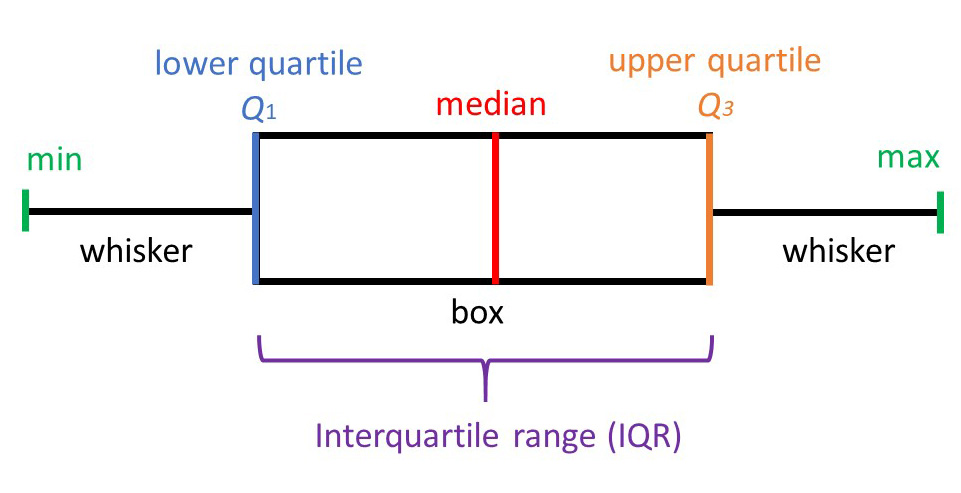
A boxplot uses IQR to display data, and potentially outliers. But to find out and remove these outliers, we will have to calculate IQR for each feature manually. First let us understand the jarguns in present in the picture.
- Min: least score, excluding outliers
- Lower quartile(Q1): 25th percentile of the data
- Median: Marks the mid point of the data
- Upper quartile(Q3): 75th percentile of the data
- Max: Highest value, again, excluding outliers
- IQR: The mid 50% of the data
- Whiskers: The lower and upper 25% of the data
Intuition behind IQR is that a normally distributed data is centered around zero mean with unit variance, therefore, likely forming a thick cluster around the mean. So a standard rule of thumb is anything outside of (Q1 - 1.5 IQR) and (Q3 + 1.5 IQR)can be treated as an outlier.
def remove_outliers(df, type='zscore'):
    """
    Method to remove outliers. This method caps the outliers with min and max values obtained from
    respective methods instead of removing them.
    :param df: a pandas dataframe
    :param type: currently supported 'zscore', 'iqr'
    :return: dataframe with outliers removed
    """
    if type=='zscore':
        threshold = 3
        df[stats.zscore(df)> threshold] = threshold
        df[stats.zscore(df)< -threshold] = -threshold
        return df
    elif type=='iqr':
        q1 = df.quantile(0.1)
        q3 = df.quantile(0.9)
        for i, (low, high) in enumerate(zip(q1,q3)):
            df[str(i)] = np.where(df[str(i)] < low, low, df[str(i)])
            df[str(i)] = np.where(df[str(i)] > high, high, df[str(i)])
        return df
    else:
        raise Exception("Unknown type specified. Please choose one in ['zscore', 'iqr']")
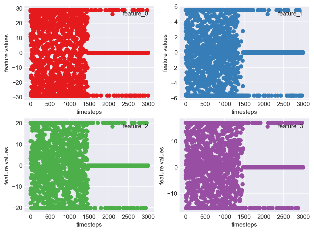
First, let us try use Z-scores to remove outliers. Anything that is above or below a standard threshold can either be capped to that threshold or the sample can be removed. In our case, let us try with capping values not within the threshold. The rule of thumb for thresold is abs(3)
data_outlier_zscored = remove_outliers(data.copy(), type='zscore')
data_outlier_zscored.describe()
| Col 0 | Col 1 | Col 2 | Col 3 | |
|---|---|---|---|---|
| count | 3000.00 | 3000.00 | 3000.00 | 3000.00 |
| mean | 0.15 | -0.02 | -0.09 | 0.14 |
| std | 17.80 | 4.97 | 12.73 | 12.64 |
| min | -77.14 | -39.31 | -44.23 | -75.94 |
| 25% | -0.46 | -0.24 | -1.15 | -0.02 |
| 50% | -0.00 | -0.00 | -0.00 | 0.00 |
| 75% | 1.19 | 0.13 | 0.35 | 0.76 |
| max | 78.06 | 42.65 | 47.14 | 91.52 |
plt.subplots_adjust(bottom=0.3, top=1.5, left=0.4, right=1.5)
for i in range(len(data_outlier_zscored.columns)):
    plt.subplot(2,2,i+1)
    plt.scatter(range(len(data_outlier_zscored)),data_outlier_zscored[str(i)], color=palette(i), label='feature_'+str(i))
    plt.xlabel('timesteps')
    plt.ylabel('feature values')
    plt.legend()
plt.show()
Clearly, this is a better looking pattern than the previous one in block 438. The values are centered around mean and show a visible pattern that a computational algorithm can take advantage of.
For our testing purpose, let us also try outlier removal with IQR.
data_outlier_iqr = remove_outliers(data.copy(), type='iqr')
data_outlier_iqr.describe()
| Col 0 | Col 1 | Col 2 | Col 3 | |
|---|---|---|---|---|
| count | 3000.00 | 3000.00 | 3000.00 | 3000.00 |
| mean | 0.04 | -0.02 | -0.06 | 0.32 |
| std | 16.47 | 2.96 | 10.85 | 8.72 |
| min | -28.86 | -5.61 | -20.17 | -15.66 |
| 25% | -0.46 | -0.24 | -1.15 | -0.02 |
| 50% | -0.00 | -0.00 | -0.00 | 0.00 |
| 75% | 1.19 | 0.13 | 0.35 | 0.76 |
| max | 28.80 | 5.50 | 20.21 | 17.08 |
plt.subplots_adjust(bottom=0.3, top=1.5, left=0.4, right=1.5)
for i in range(len(data_outlier_iqr.columns)):
    plt.subplot(2,2,i+1)
    plt.scatter(range(len(data_outlier_iqr)),data_outlier_iqr[str(i)], color=palette(i), label='feature_'+str(i))
    plt.xlabel('timesteps')
    plt.ylabel('feature values')
    plt.legend(loc=1)
plt.show()
Clearly, the IQR approach does not work here. The reason being, if we observed the boxplot we can see that data is not clustered around the median and is too spread apart. Majority of the data is outside of Q1 and Q3, although these not being outliers. Hence using this method not suitable for our use case. Let us stick to Z-score outlier treatment
Skew Check
Most machine learning algorithms assume data to be following a distribution, more specifically a guassian. Usually checking the skewness of the data will let us know if data is a guassian. Guassian distributions have a skew range of (-1,1)
data_outlier_zscored.skew()
Col 0 - 0.042878
Col 1 - 0.001488
Col 2 - 0.026184
Col 3 - 0.158650
dtype: float64
Our data is not skewed. We can skip log transformations which is one of the methods used to remove skew in data
Data Normalization
One of the important methods in predictive analytics is Data Normalization. The intuition behind this is very simple. We want to bring all the features under the same scale for computation. This way the model is not biased numerically towards any feature. With Z-score normalization, data is centered around zero mean and unit variance. Once this is achieved two values can be compared through distribution’s standard deviation. For example if person A’s score(SAT) is 2 times above standard deviation and person B’s score(ACT) is 1.5 times above standard deviation, there by we can conclude person A has a better score. So bottomline, data normalization helps create such a stage for a fair comparison and machine learning models exploit this very well.
For our use case, let us use Z-score normalization
def zscore_norm(df):
    """
    Method to normalize data using z-score approach
    :param df: a pandas dataframe
    :return: normalized dataframe
    """
    return (df-df.mean())/df.std()

data_norm = zscore_norm(data_outlier_removed)
data_norm.describe()
| Col 0 | Col 1 | Col 2 | Col 3 | |
|---|---|---|---|---|
| count | 3000.00 | 3000.00 | 3000.00 | 3000.00 |
| mean | -1.10e-17 | 1.74e-17 | -2.78e-17 | 7.44e-18 |
| std | 1.00 | 1.00 | 1.00 | 1.00 |
| min | -4.34 | -7.89 | -3.46 | -6.01 |
| 25% | -3.45e-02 | -4.34e-02 | -8.33e-02 | -1.37e-02 |
| 50% | -8.69e-03 | 5.14e-03 | 7.10e-03 | -1.14e-02 |
| 75% | 5.82e-02 | 3.24e-02 | 3.46e-02 | 4.88e-02 |
| max | 4.37 | 8.57 | 3.70 | 7.22 |
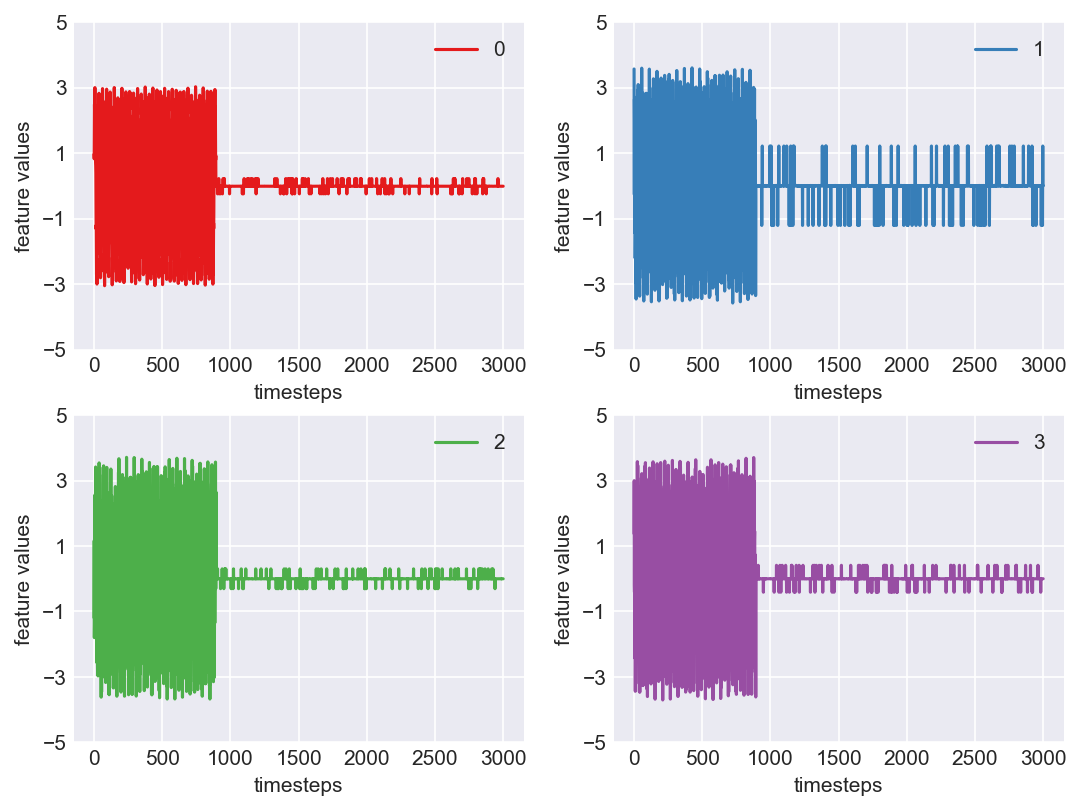
Now let us plot this data to see if the captured pattern has become evident and distinguishable, after the data wrangling techniques
mpl.rcParams['figure.dpi'] = 150
plt.plot(range(len(data_norm)), data_norm)
plt.xlabel('timesteps')
plt.ylabel('feature values')
plt.legend(data_norm.columns)
plt.show()
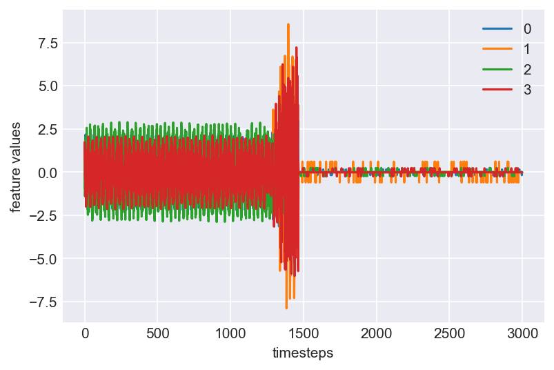
Voila!! This is beatuiful. We see a clear pattern in the machine lifecycle. This machine ran in normal mode till around 1250 timesteps. At around 1250 to 1450, it ran into a faulty mode. From timestep 1450 the machine probably entered a failed state, bringing all readings close to zero.
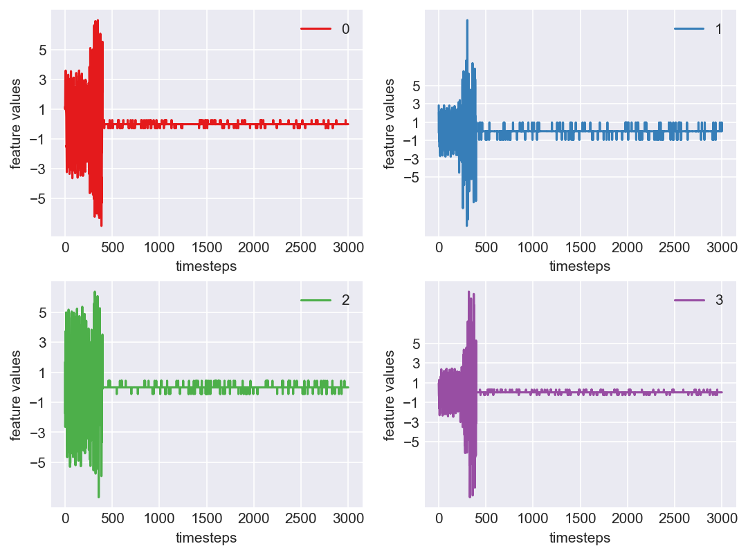
Let us visualize each feature seperately to see if what we concluded in the above statement is true
plt.subplots_adjust(bottom=0.3, top=1.5, left=0.4, right=1.5)
for i in range(4):
    obs = data_norm.iloc[:,i]
    plt.subplot(2,2,i+1)
    plt.plot(range(len(obs)), obs, color=palette(i))
    plt.legend(str(i))
    plt.yticks(range(-5,6,2))
    plt.xlabel('timesteps')
    plt.ylabel('feature values')
plt.show()
plt.close()

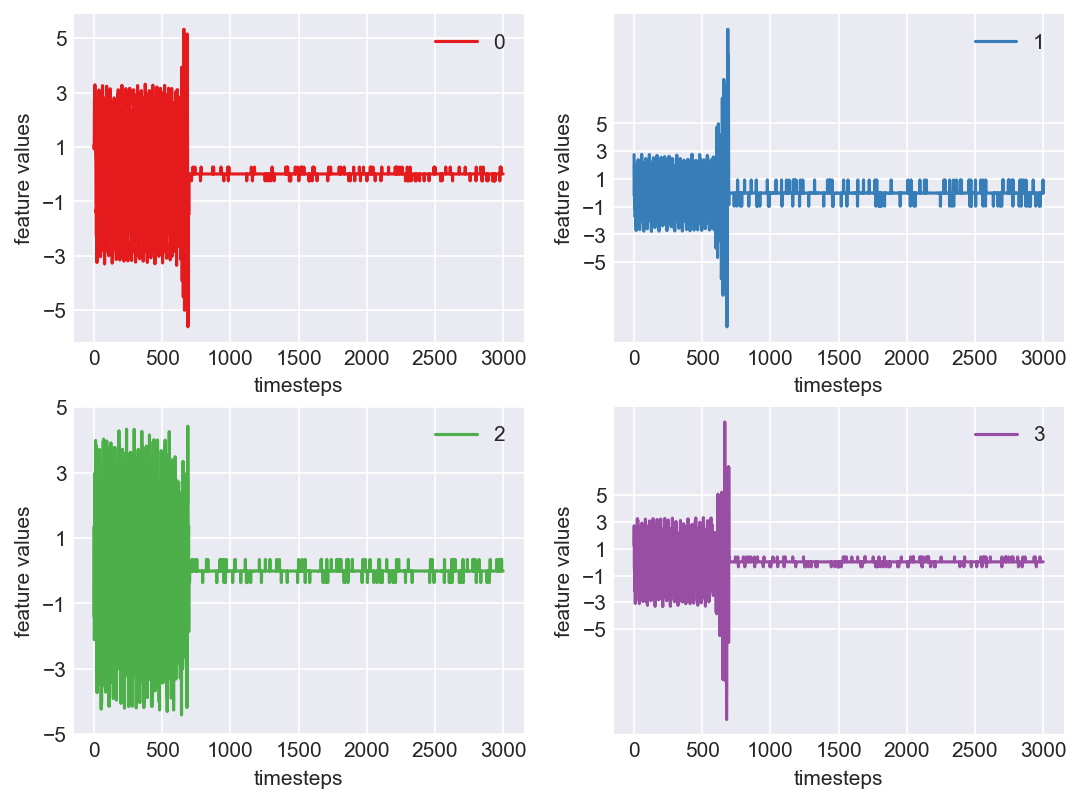
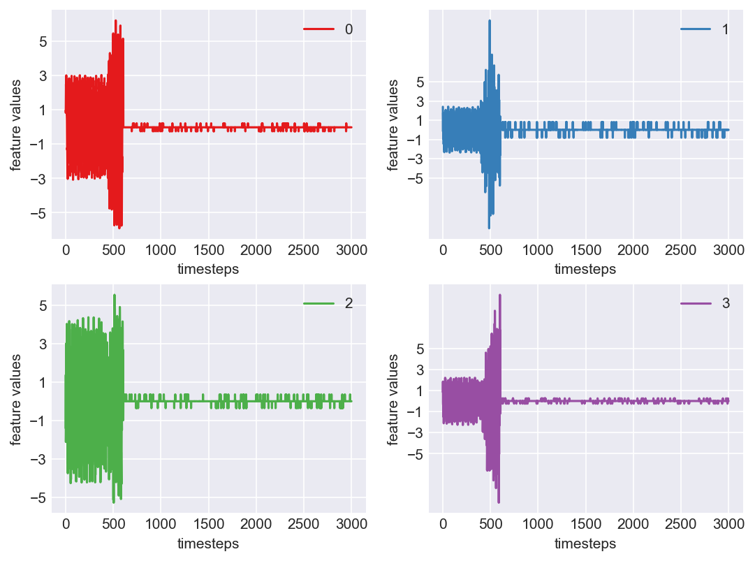
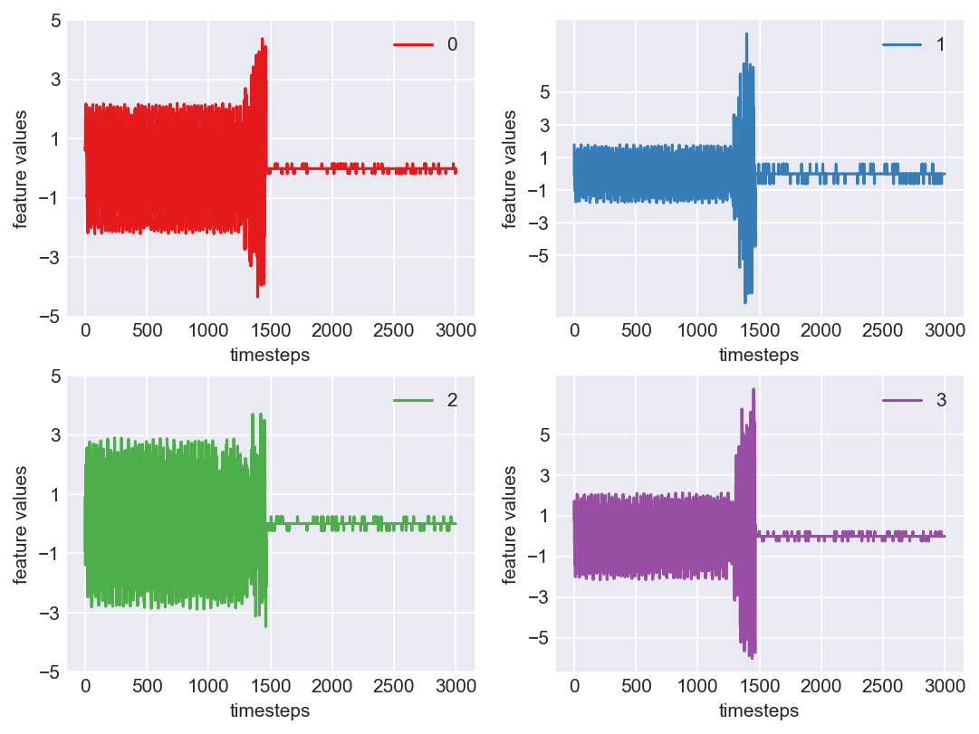
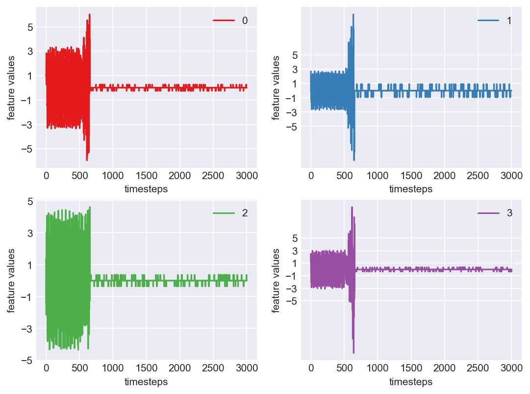
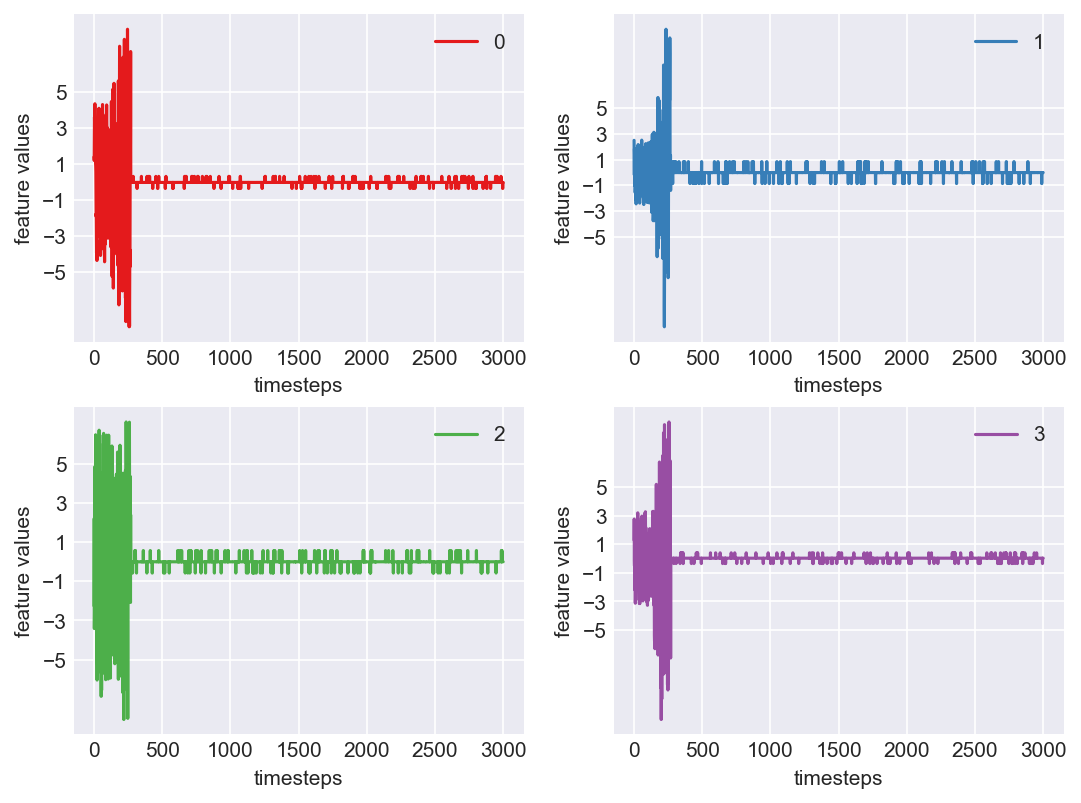
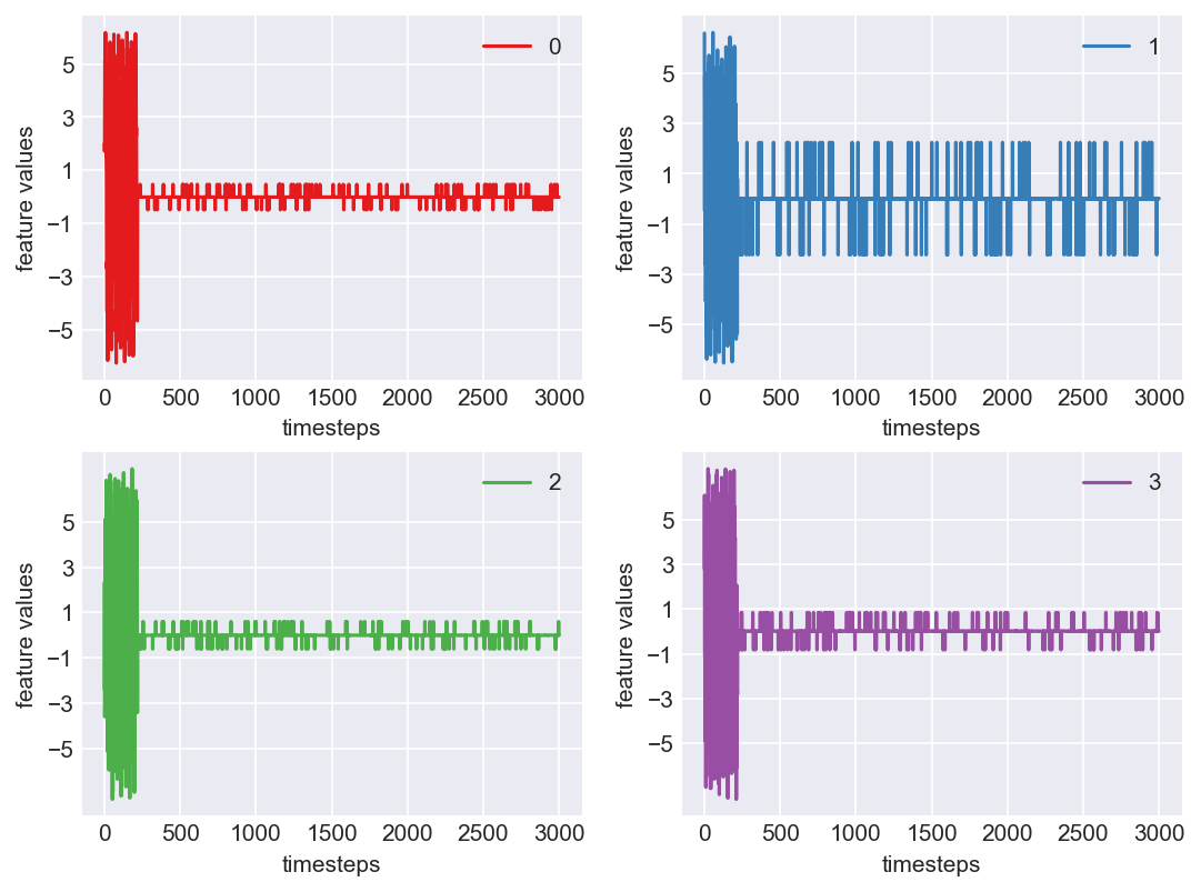
Yes! All the four features in this machine follow a similar behaviour i.e in normal mode(till 1250 timesteps) all the four features show similar behaviour with not much variance in data. When the machine enters a faulty mode, which is between 1250 to 1450 timesteps, we can see high variance in data. As the machine fails all the features stick around zero for the rest of the timesteps. We can build a computational method around this approach to pinpoint faulty and failed states.
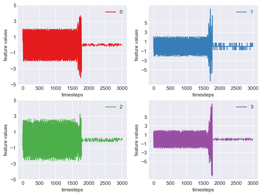
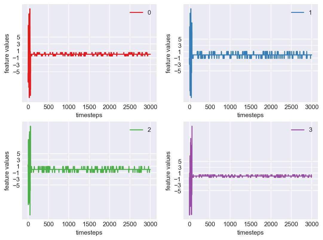
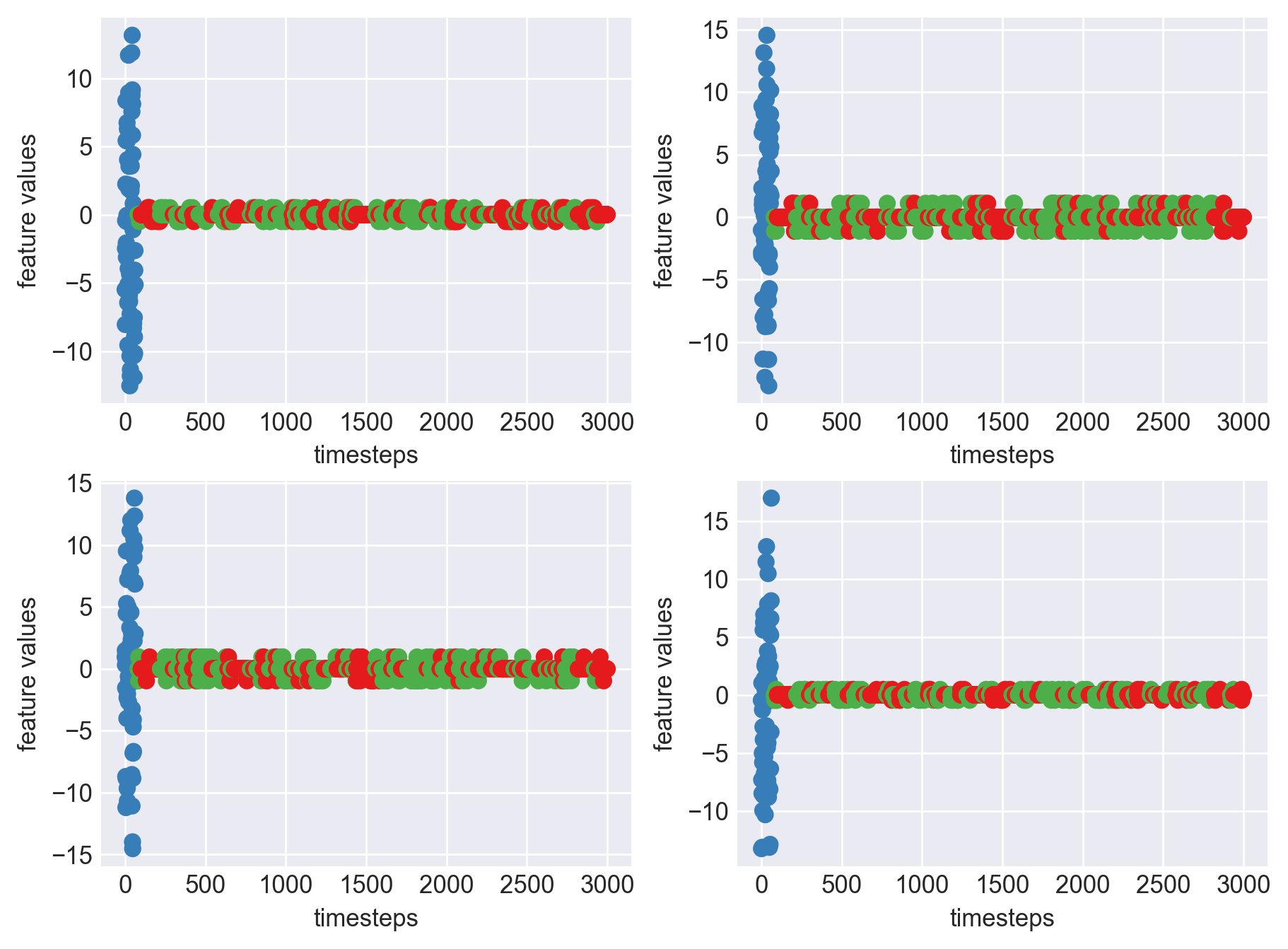
First let us observe if this behaviour persists in all the machines we have.
Data cleanse, transform and normalize for all the data frames in memory.
for idx, df in enumerate(dfs):
    # 1. Data Cleansing
    # 2. Data Transformations(Outlier removal)
    # 3. Data Normalization
    df = fix_missing_values(df)
    df = remove_outliers(df, type='zscore')
    df = zscore_norm(df)
    dfs[idx] = df
Plot each feature seperately, for each machine like we did 2 blocks above
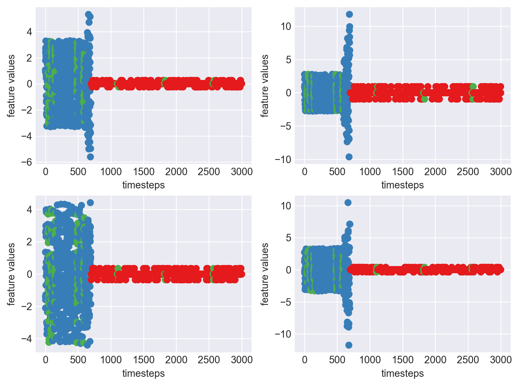
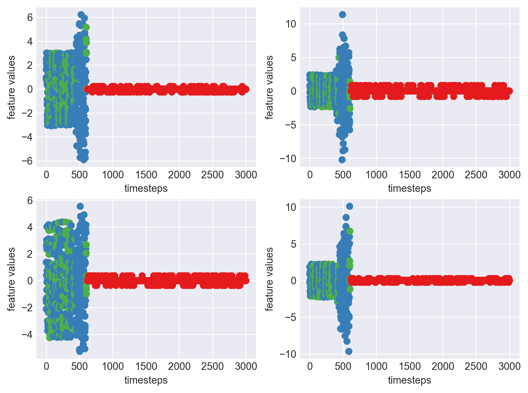
for idx, (file, df) in enumerate(zip(files, dfs)):
    plt.subplots_adjust(bottom=0.3, top=1.5, left=0.4, right=1.5)
    print('Machine - ', file.split('/')[-1], '| Data frame index - ', idx)
    for i in range(4):
        obs = df.iloc[:,i]
        plt.subplot(2,2,i+1)
        plt.plot(range(len(obs)), obs, color=palette(i))
        plt.legend(str(i))
        plt.yticks(range(-5,6,2))
        plt.xlabel('timesteps')
        plt.ylabel('feature values')
    plt.show()
    plt.close()
 Machine - machine_14.csv | Data frame index - 1
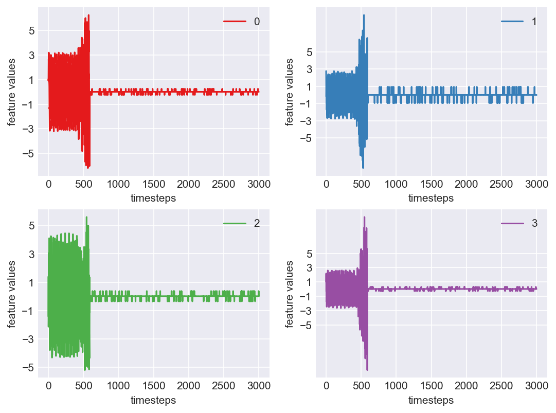
 Machine - machine_15.csv | Data frame index - 2
 Machine - machine_4.csv | Data frame index - 3
 Machine - machine_6.csv | Data frame index - 4
 Machine - machine_17.csv | Data frame index - 5
 Machine - machine_16.csv | Data frame index - 6
 Machine - machine_7.csv | Data frame index - 7
 Machine - machine_3.csv | Data frame index - 8
 Machine - machine_12.csv | Data frame index - 9
 Machine - machine_13.csv | Data frame index - 10
 Machine - machine_2.csv | Data frame index - 11
 Machine - machine_0.csv | Data frame index - 12
 Machine - machine_11.csv | Data frame index - 13
 Machine - machine_10.csv | Data frame index - 14
 Machine - machine_1.csv | Data frame index - 15
 Machine - machine_9.csv | Data frame index - 16
 Machine - machine_18.csv | Data frame index - 17
 Machine - machine_19.csv | Data frame index - 18
 Machine - machine_8.csv | Data frame index - 19
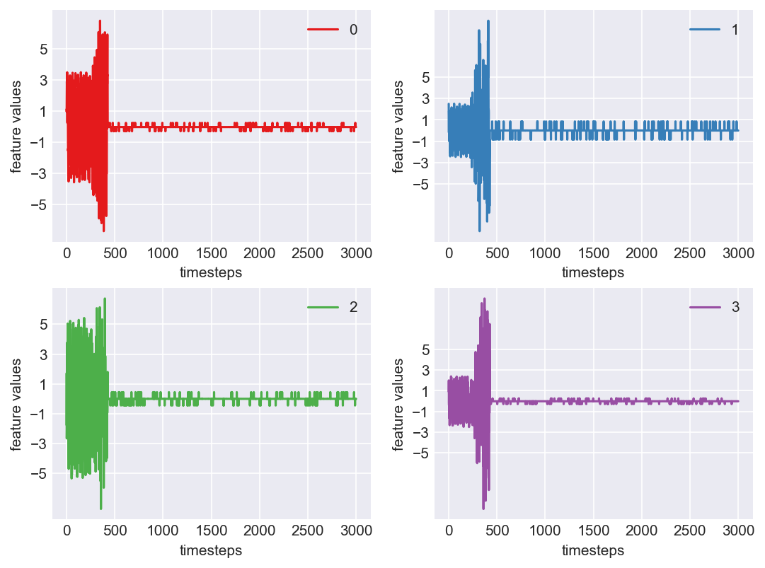
 As we see, expected behaviour is observed. We can goahead and build a computational method to capture thi behaviour
## Stage 4 (Final Stage): Computational Inference (Prediction)
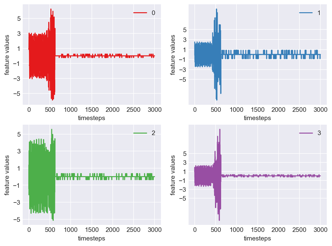
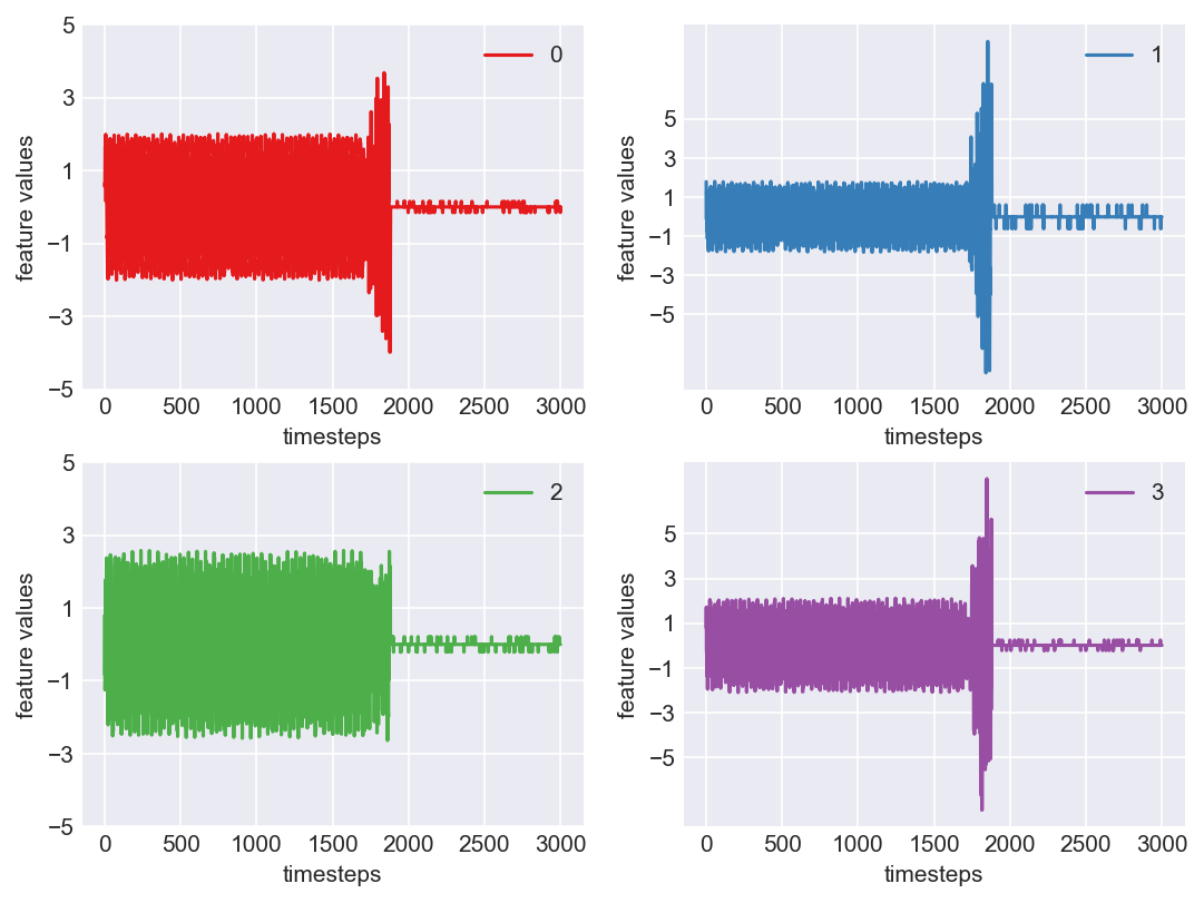
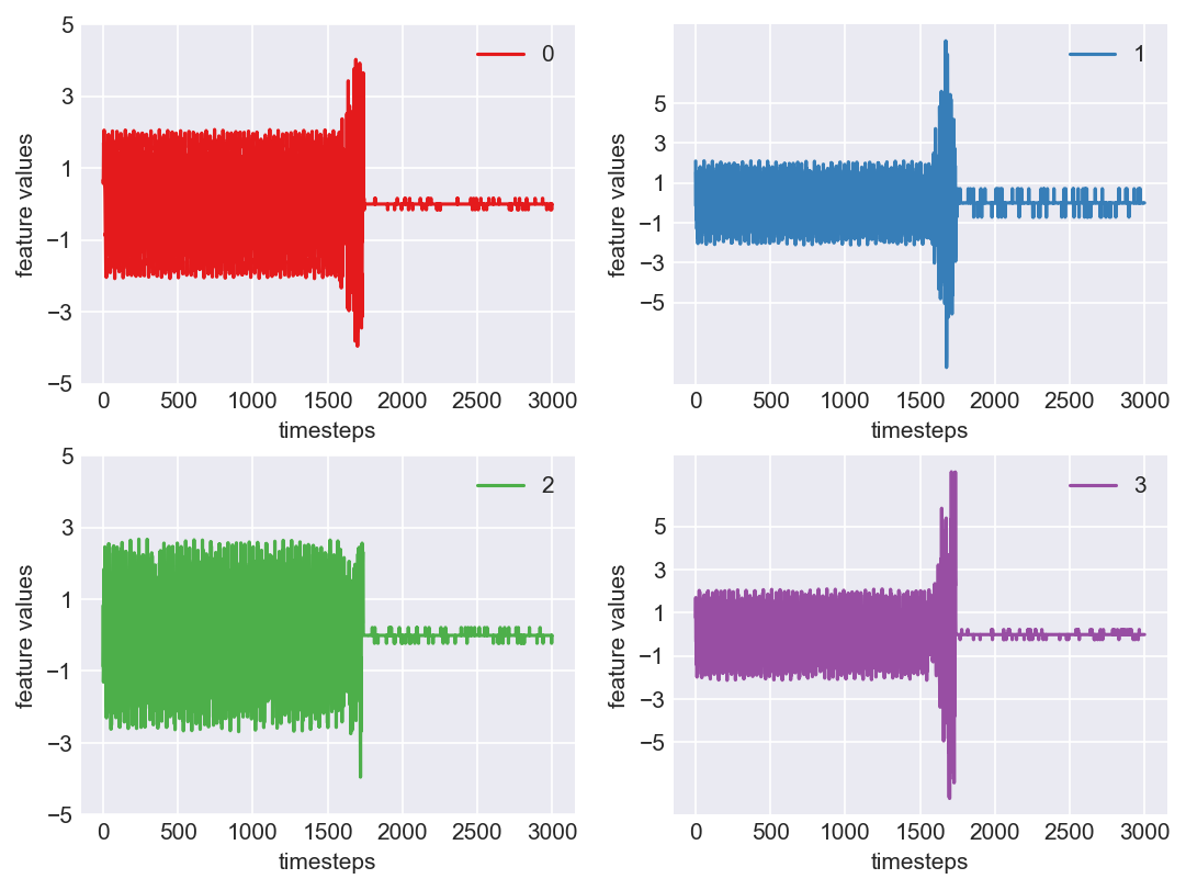
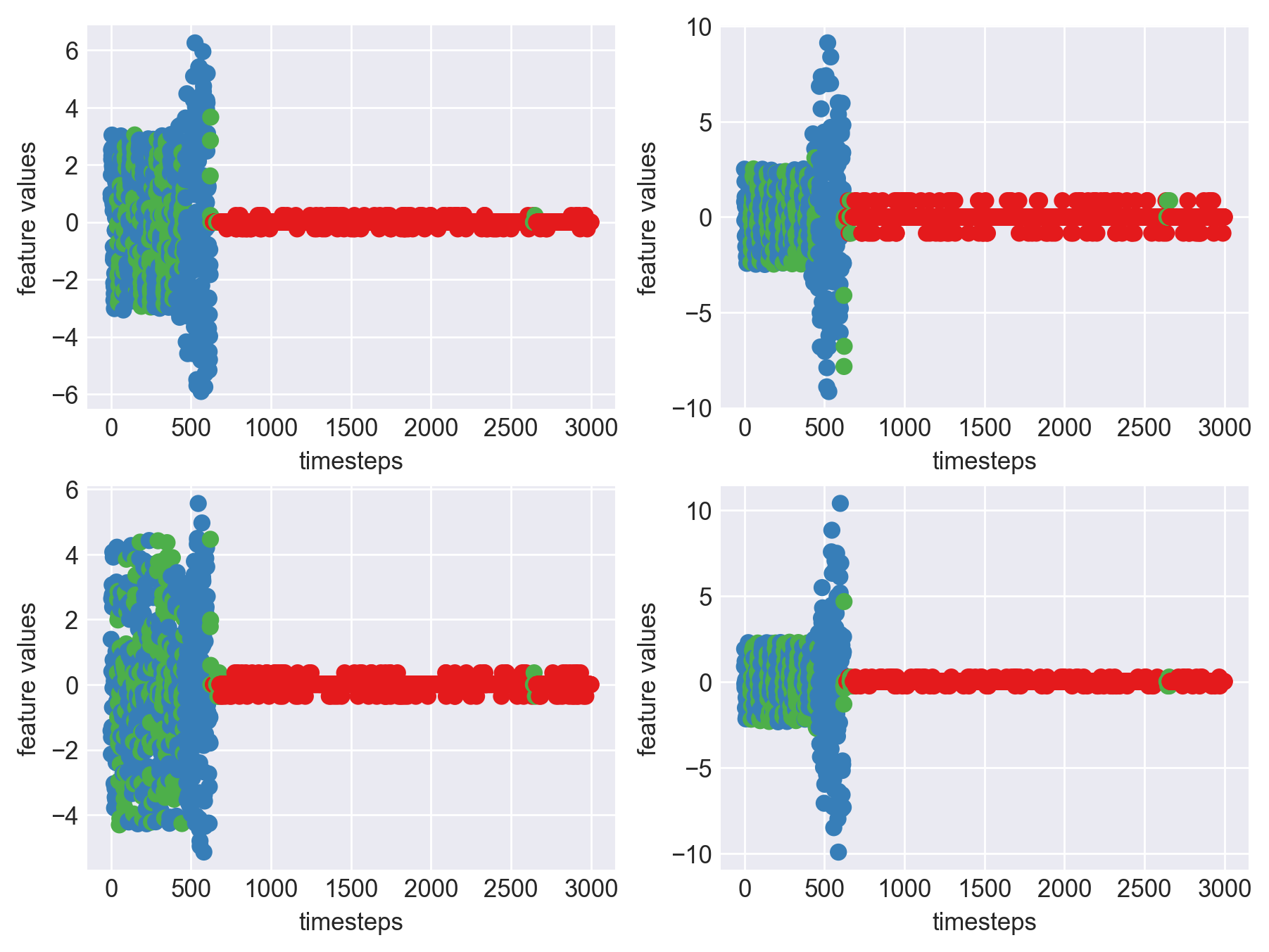
Let us see the variance of data in normal mode, faulty mode and failed mode. For demonstration purposes let us pick data from machine 7, which is in the 8th position
As we see, expected behaviour is observed. We can goahead and build a computational method to capture thi behaviour
## Stage 4 (Final Stage): Computational Inference (Prediction)
Let us see the variance of data in normal mode, faulty mode and failed mode. For demonstration purposes let us pick data from machine 7, which is in the 8th position
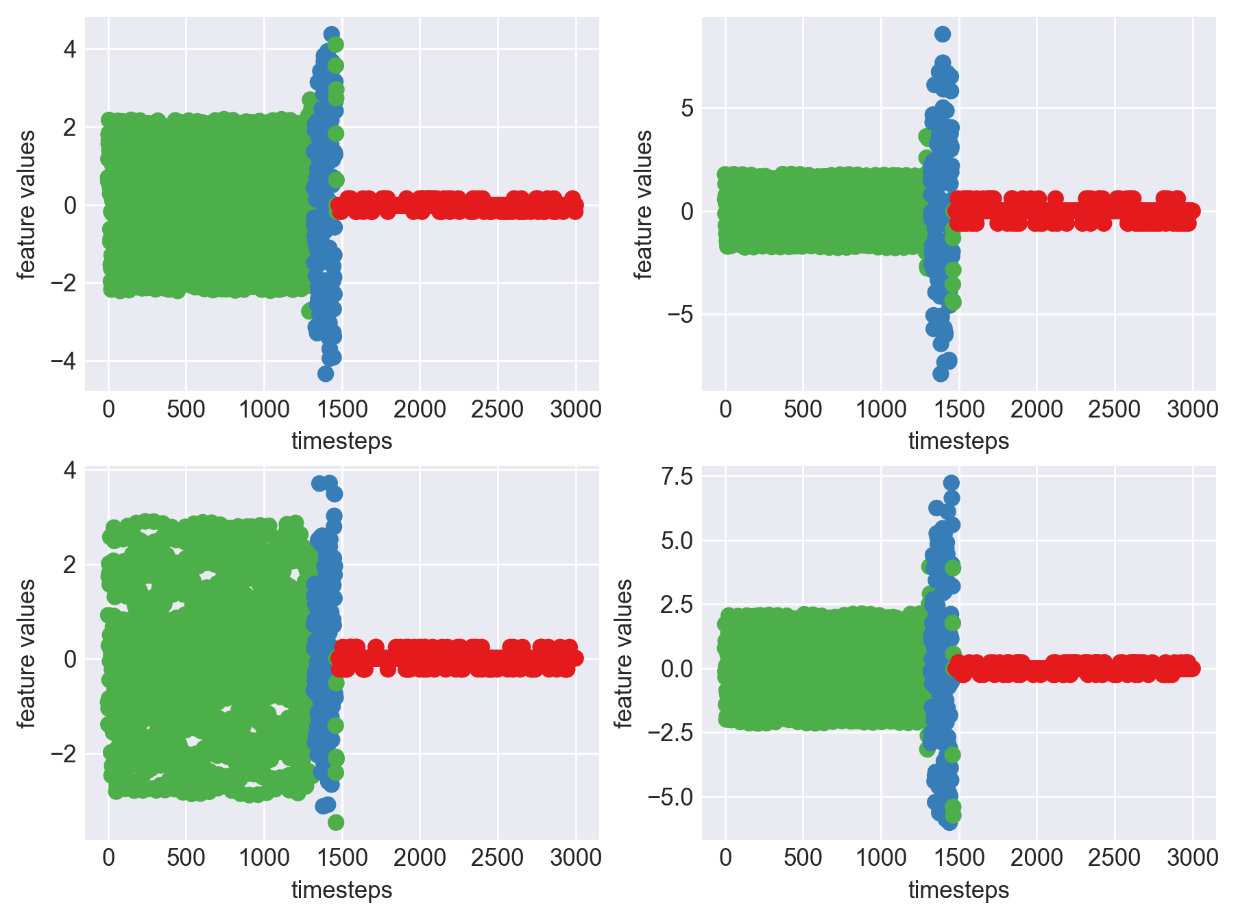
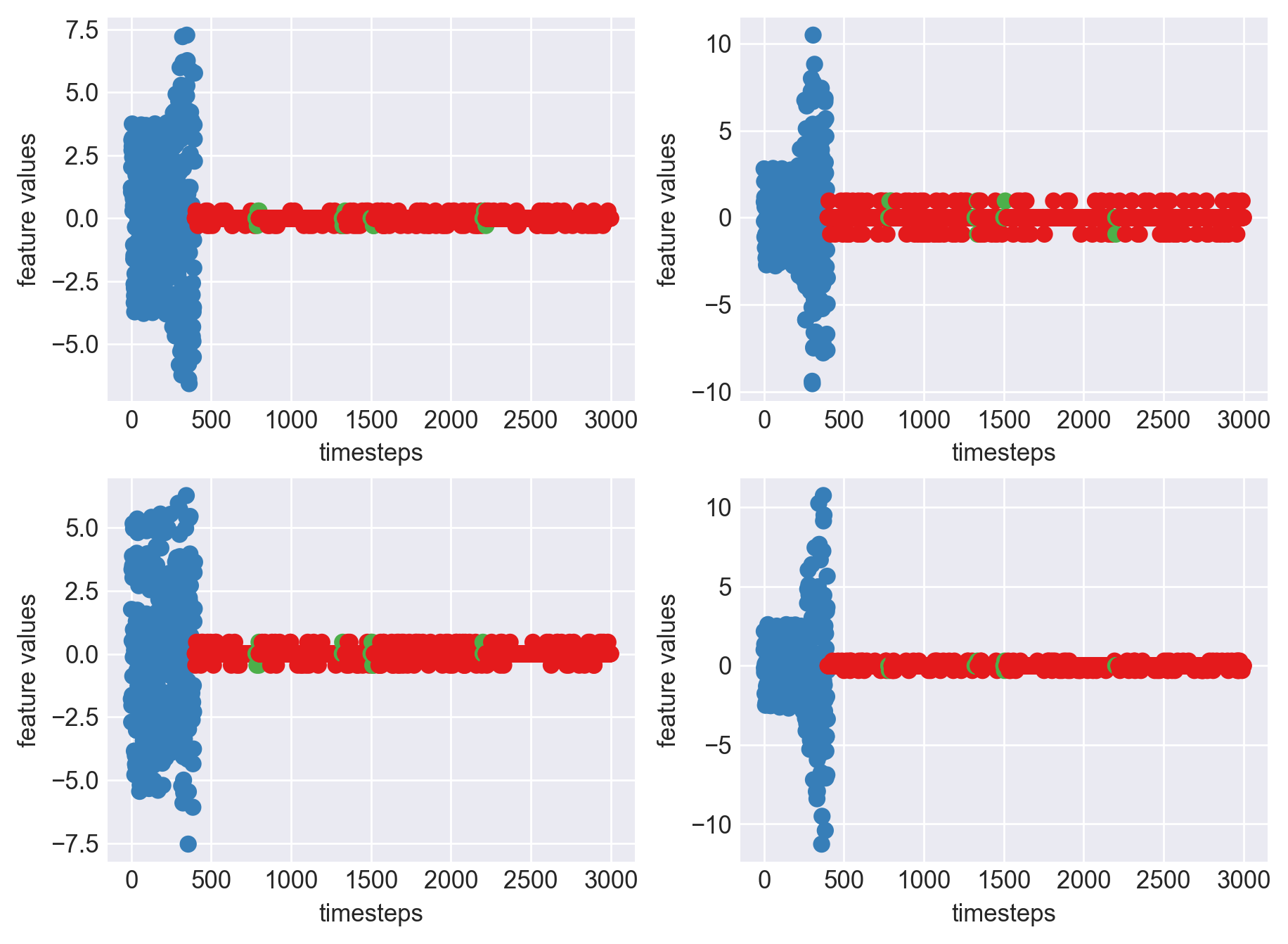
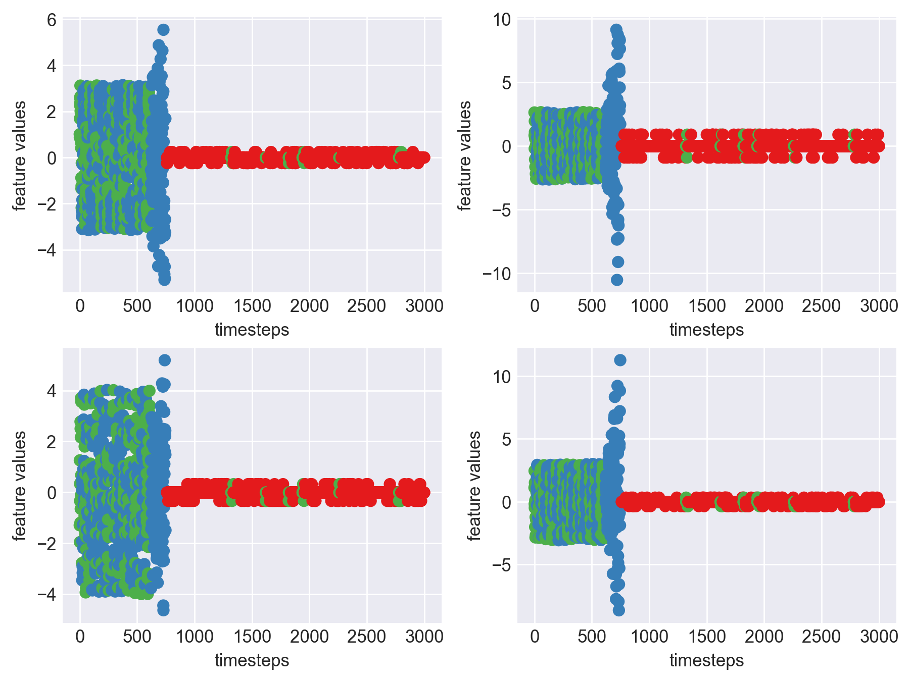
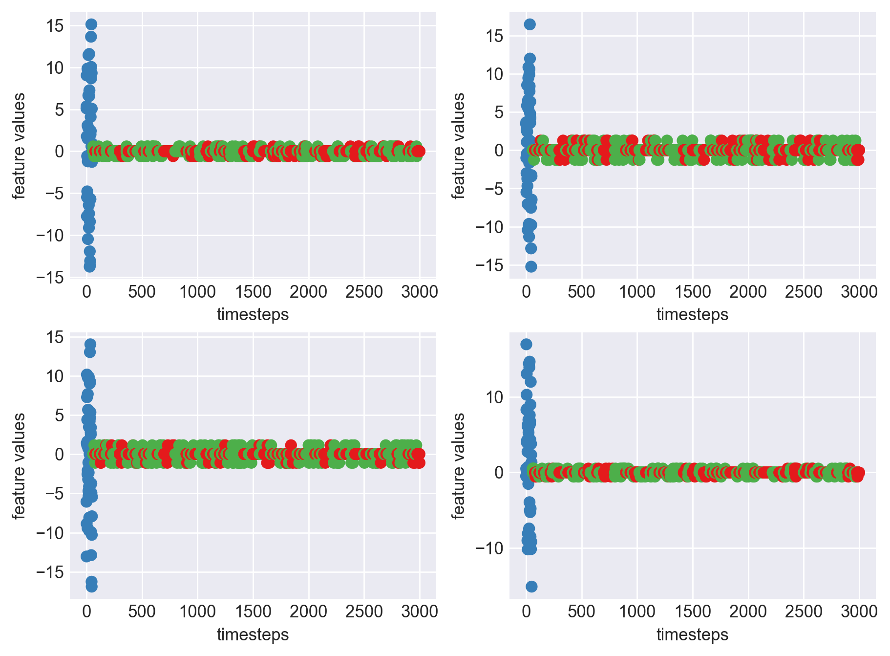
print('*** Machine 7 plots ***')
machine7 = dfs[7]
plt.subplots_adjust(bottom=0.3, top=1.5, left=0.4, right=1.5)
for i in range(4):
    obs = machine7.iloc[:,i]
    plt.subplot(2,2,i+1)
    plt.plot(range(len(obs)), obs, color=palette(i))
    plt.legend(str(i))
    plt.yticks(range(-5,6,2))
    plt.xlabel('timesteps')
    plt.ylabel('feature values')
plt.show()
plt.close()
*** Machine 7 plots ***

As we can see, this machine runs normally till around 1200 timesteps. From timesteps 1200 to 1450 we can suspect the machine to be in fauly state, from around 1450 the machine enters a fail state. Let us build a hypothesis using this behaviour and extrapolate it on all our machines to see if all of them showcase similar behaviour(at different timesteps though)
print('*** Machine 7 statistics ***\n')
def print_stats(data, mode):
    """
    Method to print min, max, variance of a pandas dataframe
    :param df: a pandas dataframe
    """
    if mode is None:
        raise Exception('Please specify mode. Options->["normal", "faulty", "failed"]')
    feature1 = data.iloc[:,0]
    feature2 = data.iloc[:,1]
    feature3 = data.iloc[:,2]
    feature4 = data.iloc[:,3]
    print(f'Range and variance of features in {mode} mode')
    print("Feature 1 - ",feature1.min(), '|', feature1.max(), '|', feature1.var())
    print("Feature 2 - ",feature2.min(), '|', feature2.max(), '|', feature2.var())
    print("Feature 3 - ",feature3.min(), '|', feature3.max(), '|', feature3.var())
    print("Feature 4 - ",feature4.min(), '|', feature4.max(), '|',  feature4.var(),'\n\n')


# Range and variance of features in normal mode
normal_mode = 1200
normal_data = machine7[:normal_mode]
print_stats(normal_data, 'normal')

# Range and variance of features in faulty mode
faulty_mode = [1250,1450]
faulty_data = machine7[faulty_mode[0]:faulty_mode[1]]
print_stats(faulty_data, 'faulty')

# Range and variance of features in failed mode
fail_mode = 1450
fail_data = machine7[fail_mode:]
print_stats(fail_data, 'fail')
*** Machine 7 statistics ***

Range and variance of features in normal mode
Feature 1 -  -2.21 | 2.19 | 1.75
Feature 2 -  -1.78 | 1.79 | 0.77
Feature 3 -  -2.88 | 2.89 | 2.03
Feature 4 -  -2.15 | 2.12 | 1.08


Range and variance of features in faulty mode
Feature 1 -  -4.34 | 4.37 | 3.62
Feature 2 -  -7.89 | 8.57 | 9.45
Feature 3 -  -3.12 | 3.70 | 1.92
Feature 4 -  -6.01 | 6.24 | 6.85


Range and variance of features in fail mode
Feature 1 -  -2.29 | 4.11 | 0.05
Feature 2 -  -4.42 | 4.05 | 0.09
Feature 3 -  -3.46 | 3.48 | 0.04
Feature 4 -  -5.73 | 7.22 | 0.17
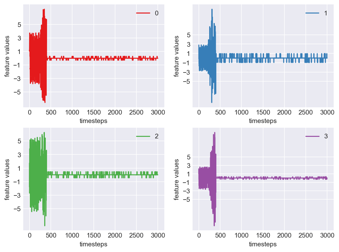
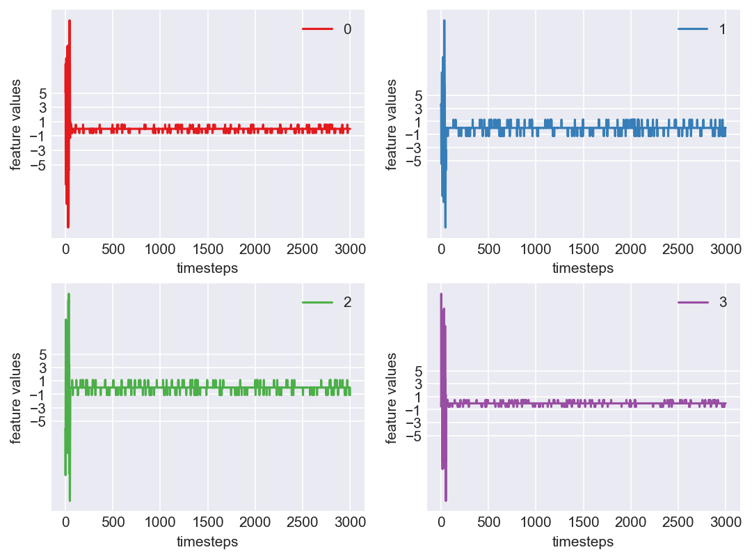
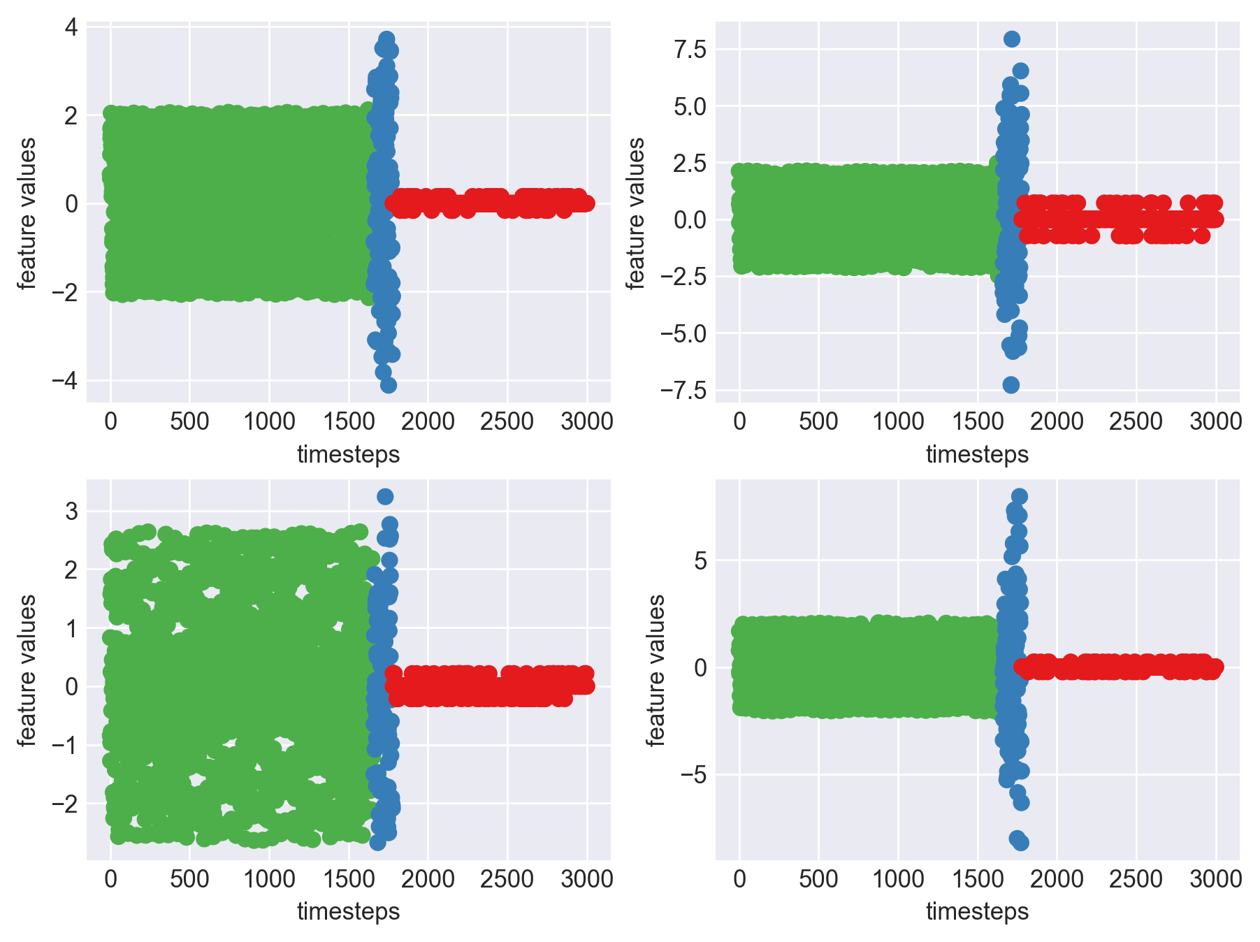
Let us carry out the same analysis on some other machine to verify and cross check if there are any patterns across machine that we can generalize to create a computational method.
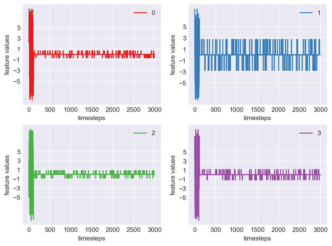
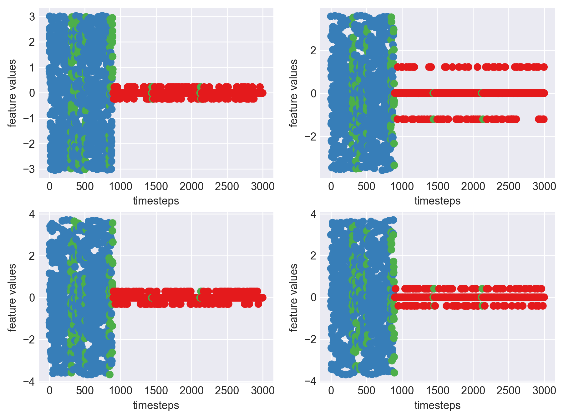
print('*** Machine 15 plots ***')
machine15 = dfs[2]
plt.subplots_adjust(bottom=0.3, top=1.5, left=0.4, right=1.5)
for i in range(4):
    obs = machine15.iloc[:,i]
    plt.subplot(2,2,i+1)
    plt.plot(range(len(obs)), obs, color=palette(i))
    plt.legend(str(i))
    plt.yticks(range(-5,6,2))
    plt.xlabel('timesteps')
    plt.ylabel('feature values')
plt.show()
plt.close()
*** Machine 15 plots ***

print('*** Machine 15 statistics ***\n')

def print_stats(data, mode):
    """
    Method to print min, max, variance of a pandas dataframe
    :param df: a pandas dataframe
    """
    if mode is None:
        raise Exception('Please specify mode. Options->["normal", "faulty", "failed"]')
    feature1 = data.iloc[:,0]
    feature2 = data.iloc[:,1]
    feature3 = data.iloc[:,2]
    feature4 = data.iloc[:,3]
    print(f'Range and variance of features in {mode} mode')
    print("Feature 1 - ",feature1.min(), '|', feature1.max(), '|', feature1.var())
    print("Feature 2 - ",feature2.min(), '|', feature2.max(), '|', feature2.var())
    print("Feature 3 - ",feature3.min(), '|', feature3.max(), '|', feature3.var())
    print("Feature 4 - ",feature4.min(), '|', feature4.max(), '|',  feature4.var(),'\n\n')


# Range and variance of features in normal mode
normal_mode = 1500
normal_data = machine15[:normal_mode]
print_stats(normal_data, 'normal')

# Range and variance of features in faulty mode
faulty_mode = [1700,1800]
faulty_data = machine15[faulty_mode[0]:faulty_mode[1]]
print_stats(faulty_data, 'faulty')

# Range and variance of features in failed mode
fail_mode = 1800
fail_data = machine15[fail_mode:]
print_stats(fail_data, 'fail')
*** Machine 15 statistics ***

Range and variance of features in normal mode
Feature 1 -  -2.06 | 2.05 | 1.55
Feature 2 -  -2.13 | 2.13 | 1.10
Feature 3 -  -2.63 | 2.63 | 1.69
Feature 4 -  -2.05 | 2.07 | 1.02


Range and variance of features in faulty mode
Feature 1 -  -4.11 | 3.70 | 3.52
Feature 2 -  -7.31 | 7.92 | 8.82
Feature 3 -  -2.50 | 3.23 | 1.49
Feature 4 -  -8.20 | 7.96 | 10.90


Range and variance of features in fail mode
Feature 1 -  -0.16 | 0.15 | 0.00
Feature 2 -  -0.72 | 0.71 | 0.02
Feature 3 -  -0.21 | 0.21 | 0.00
Feature 4 -  -0.21 | 0.23 | 0.00
Some Observations
- Across all three modes there is a clear distinctive differnce in their stats.
- Normal mode’s variance is around 1 to 1.5
- Faulty mode, as expected, has a high variance. It is around thrice the variance of normal mode
- Fail mode, has little to no variance due to data being zeros
- This inference can be made across all the machines as the behaviour is similar, as seen in the graphs plotted for each machine in block 453 above.
- We can say, if two out of four features have variance above a so called “normal variance”, then we can falg it as faulty and raise an alarm.
Approach
- As discussed, we can track the variance of features of a machine for every ‘n’ timesteps to see if it is above ‘normal variance’. If it is, then we flag it faulty.
- Also, if the computational method missed finding a faulty case, then we atleast need to inform when the machine is in failed state. This is fairly simple to do as the variance in data is almost close to zero.
Let us definte few variables required for our computation:
- normal variance: 1
- faulty variance limit: 3 * normal variance
- fail mode variance: lesser than 0.01
- n: number of timesteps to consider at once for variance check: 20
def inference(df):
def label_data(data):
if data is None or len(data) == 0:
raise Exception('Data is empty')
variance = data.var()
if (variance > faulty_var).sum() >= 2:
return 'faulty'
elif (variance < failed_var).sum() >=2:
return 'failed'
else:
return 'normal'
### Hyperparameters - start ###
n = 20
normal_mode_var = 1
faulty_var = 3*normal_mode_var
failed_var = 0.01
### Hyperparameters - end ###
df['mode'] = 'failed'
start = 0
for end in range(n, len(df), n):
mode = label_data(df[start:end])
df.loc[start:end, 'mode'] = mode
start+=n
return df
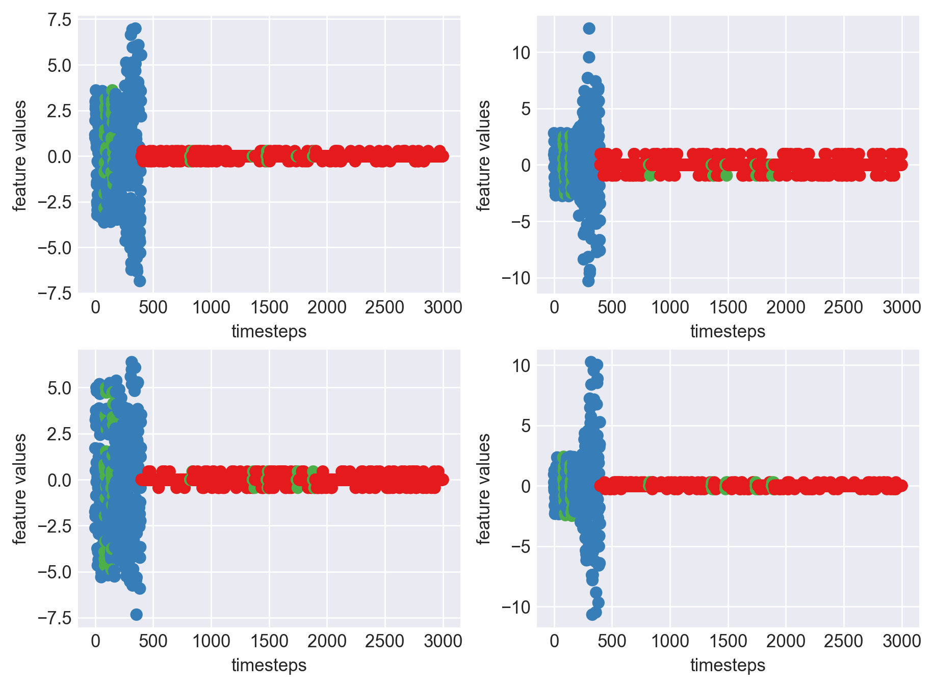
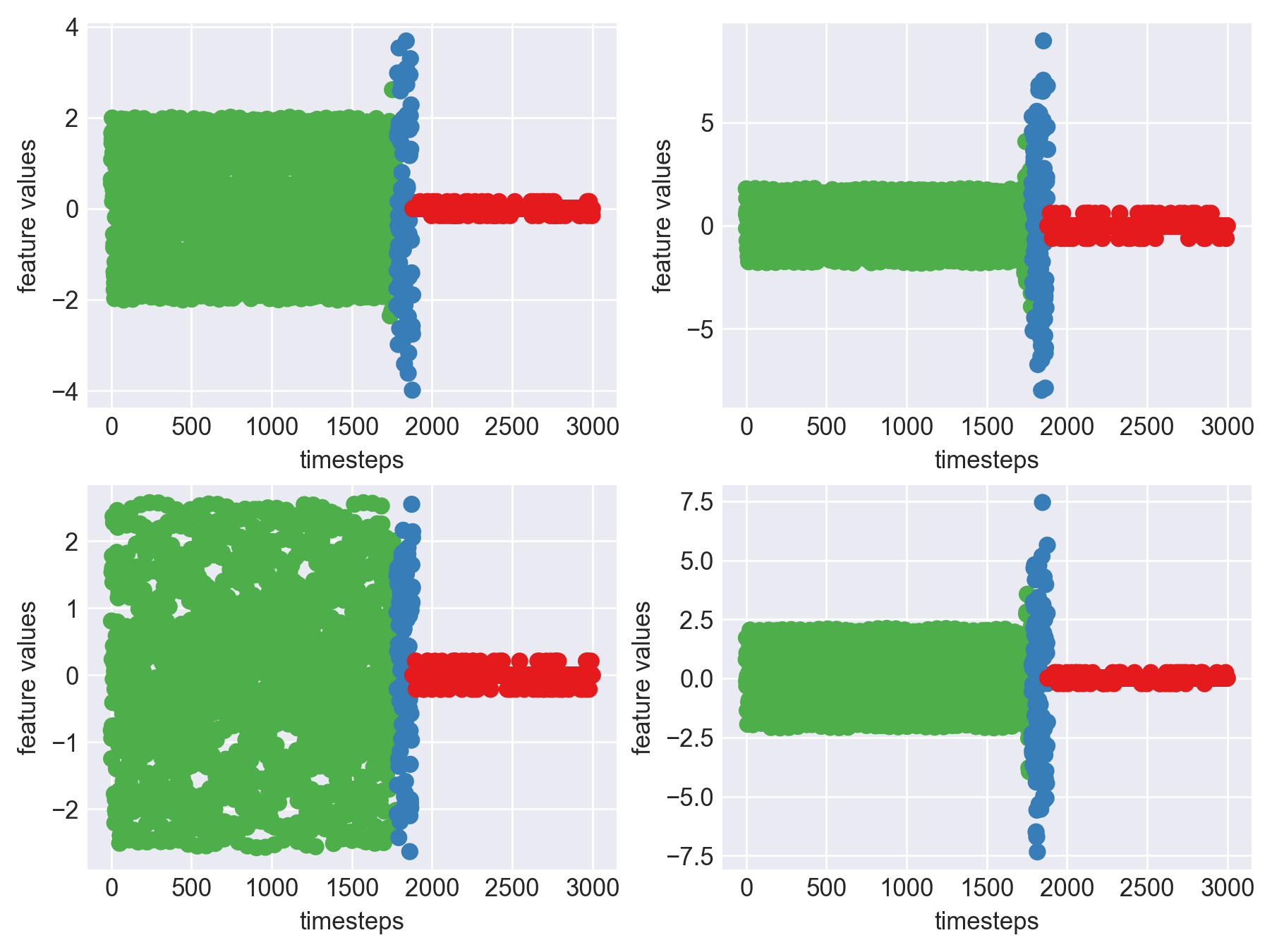
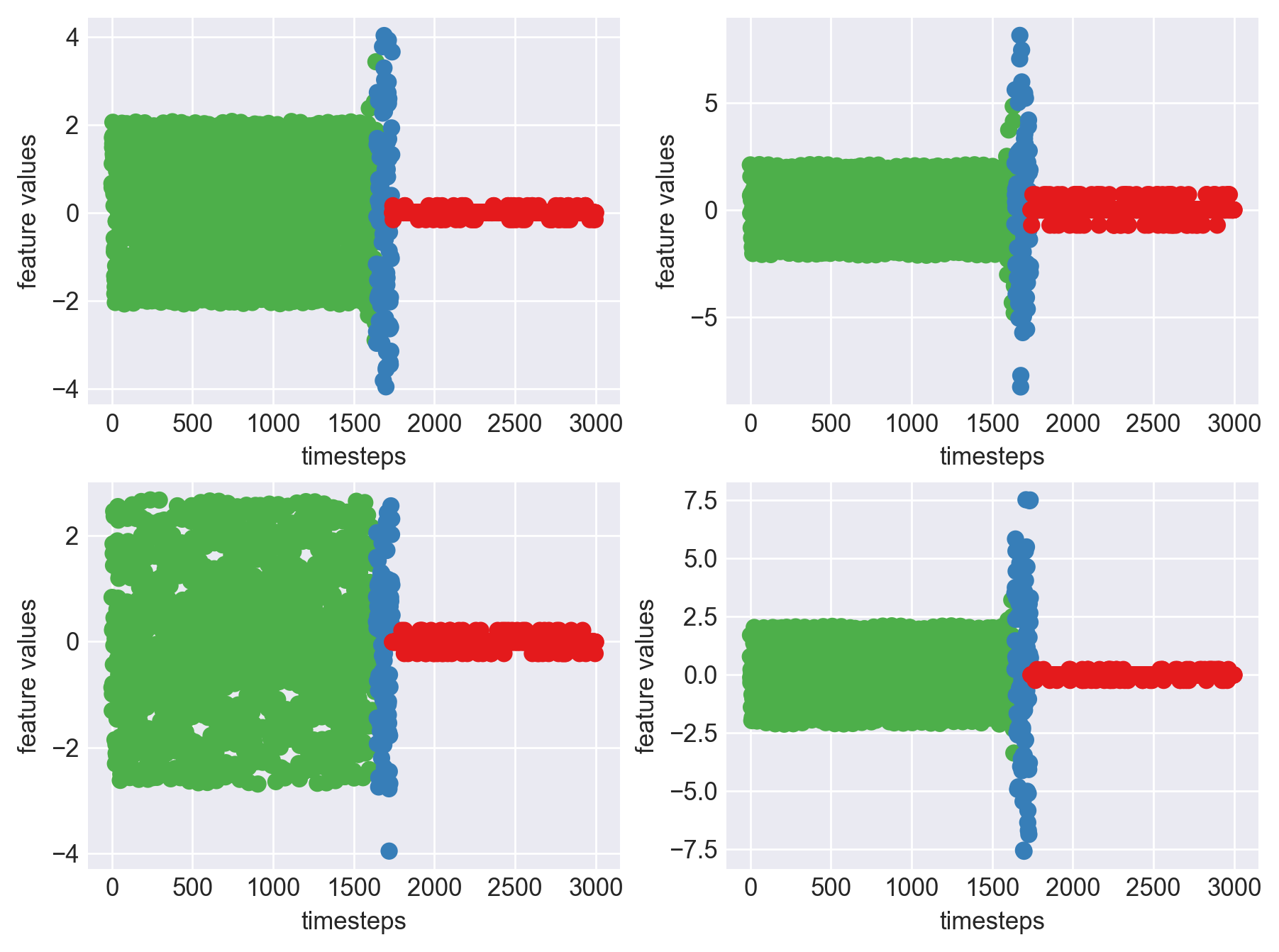
machine15 = inference(machine15)
machine15.head()
| Col 0 | Col 1 | Col 2 | Col 3 | Machine's Mode |
|---|---|---|---|---|
| 0.65 | 2.11 | -0.84 | 0.77 | normal |
| 0.56 | 0.66 | 0.82 | 1.67 | normal |
| 1.09 | -0.16 | -1.27 | -0.21 | normal |
| 1.68 | 1.55 | -0.96 | -0.31 | normal |
| 1.46 | 0.87 | 1.57 | 1.04 | normal |
print('*** Machine 15 plots ***')
plt.subplots_adjust(bottom=0.3, top=1.5, left=0.4, right=1.5)
mpl.rcParams['figure.dpi'] = 250
data_len = len(machine15)
colors = {'normal':palette(2), 'faulty':palette(1), 'failed':palette(0)}
for i in range(4):
    plt.subplot(2,2,i+1)
    plt.scatter(range(data_len), machine15[str(i)], c=machine15['mode'].apply(lambda x: colors[x]))
    plt.xlabel('timesteps')
    plt.ylabel('feature values')
plt.show()
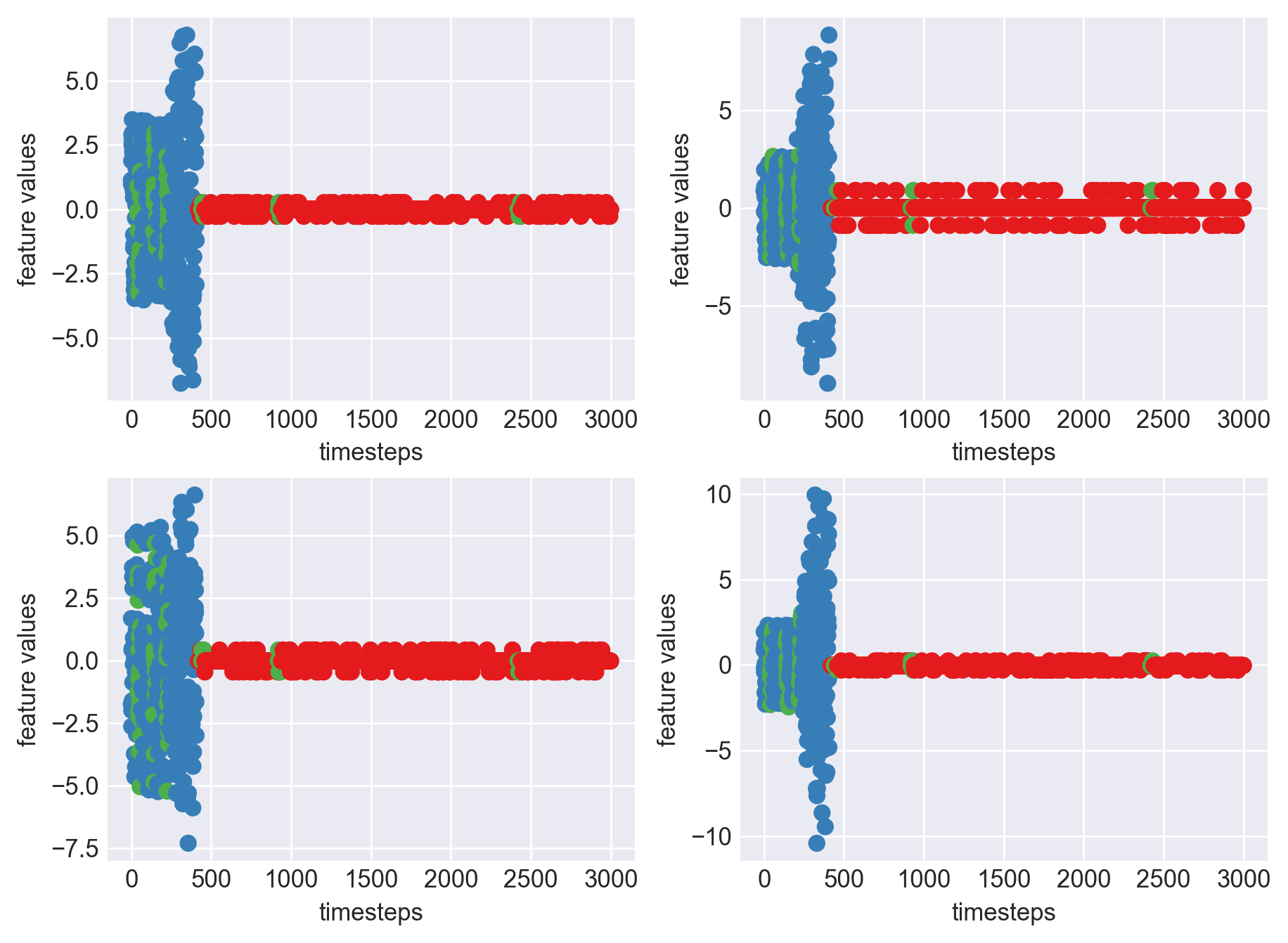
*** Machine 15 plots ***

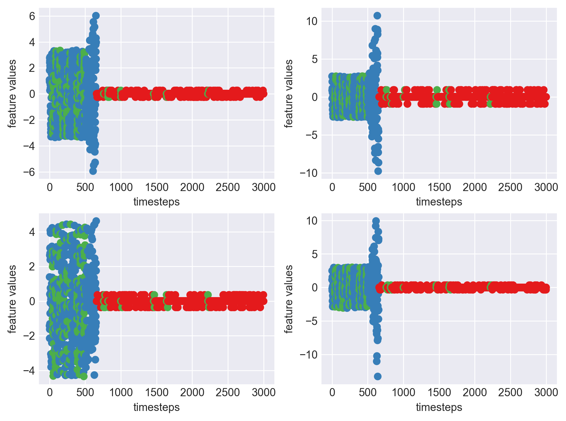
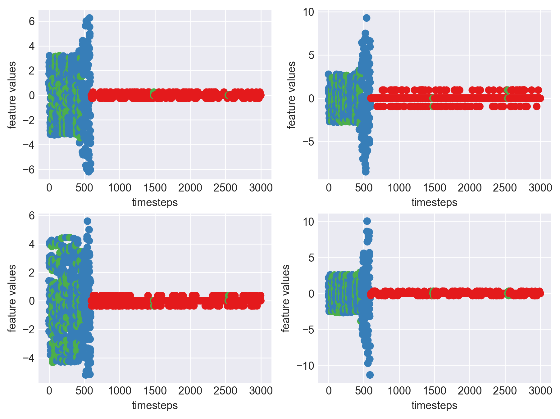
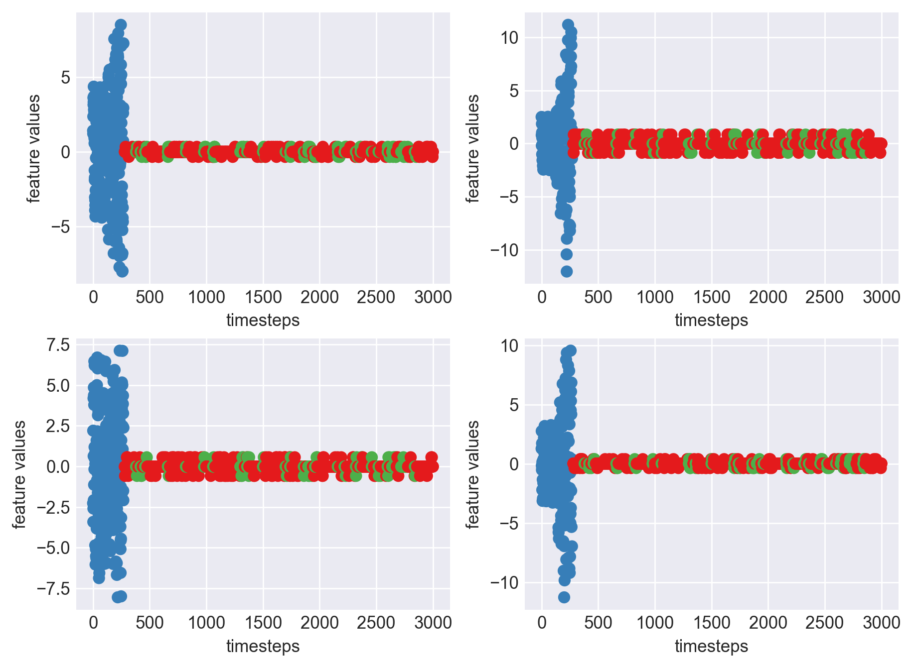
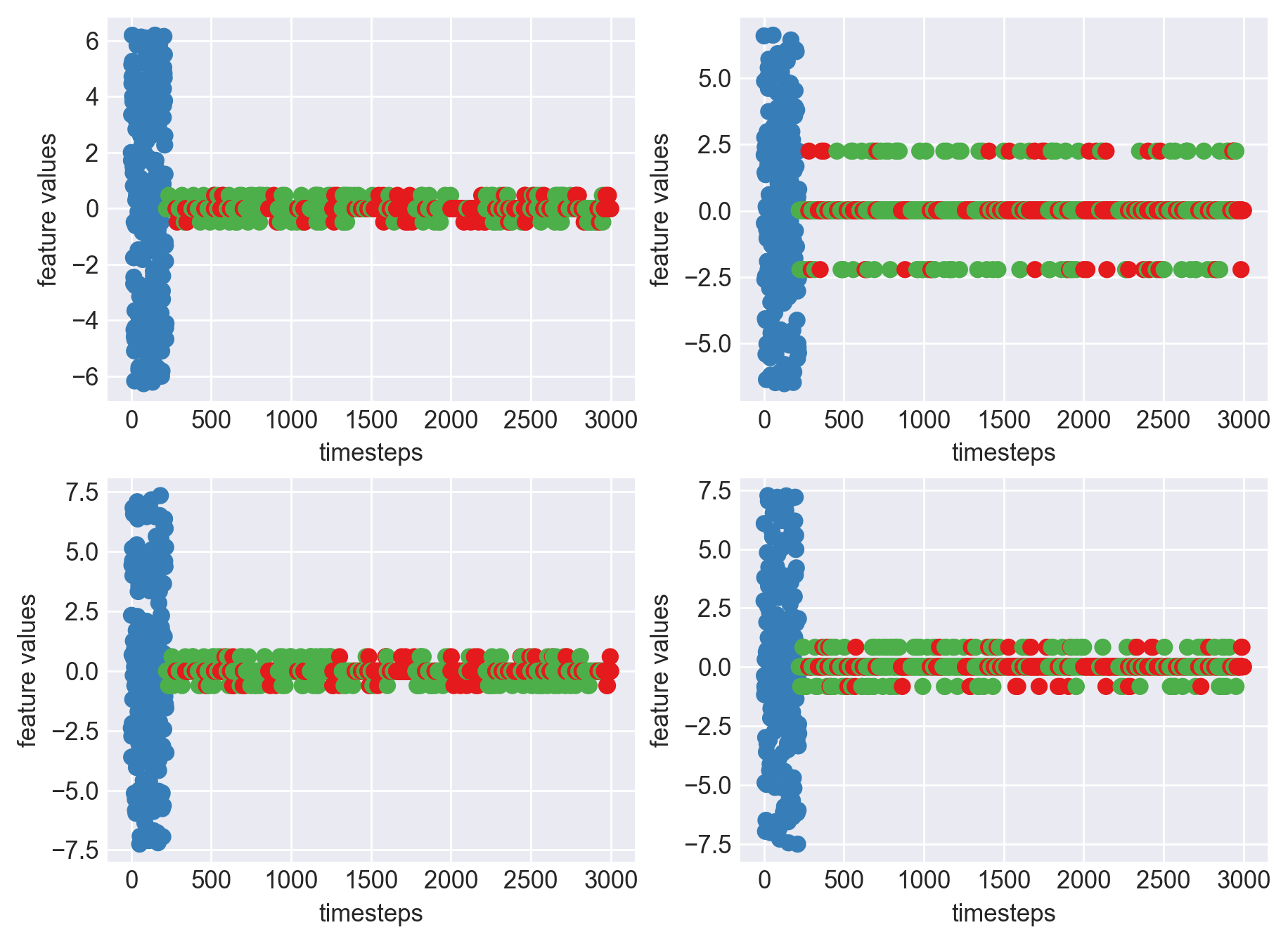
As we can clearly observe, our approach is working on identifying the when the machine was running normally, when it entered a faulty mode and when it failed. Let us now extrapolate this approach on all our machine dataframes
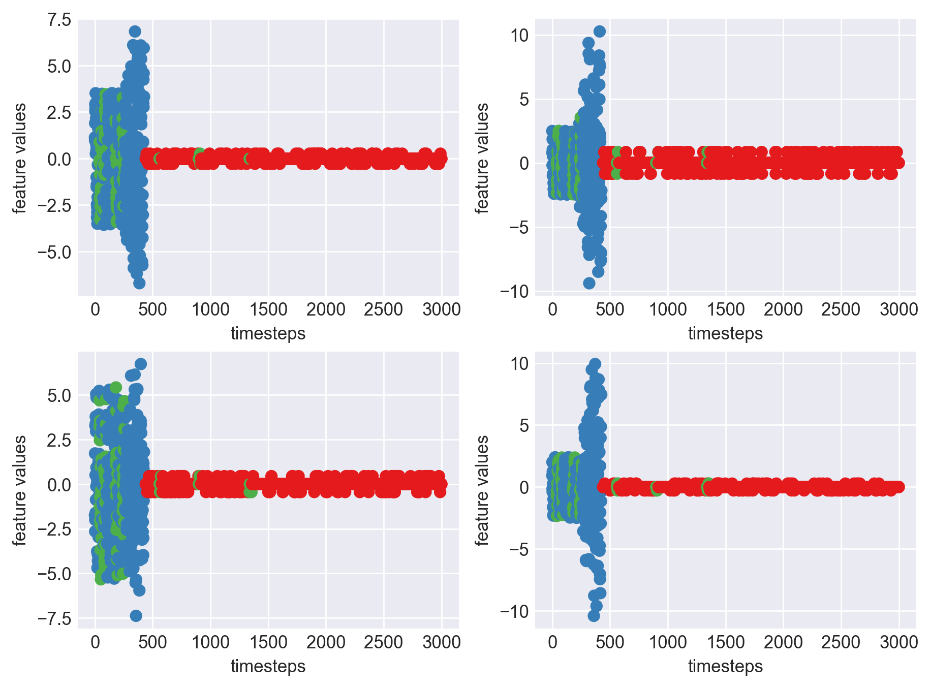
mpl.rcParams['figure.dpi'] = 250
for idx, (file, df) in enumerate(zip(files, dfs)):
    plt.subplots_adjust(bottom=0.3, top=1.5, left=0.4, right=1.5)
    print('Machine - ', file.split('/')[-1], '| Data frame index - ', idx)
    df = inference(df)
    data_len = len(df)
    colors = {'normal':palette(2), 'faulty':palette(1), 'failed':palette(0)}
    for i in range(4):
        plt.subplot(2,2,i+1)
        plt.scatter(range(data_len), df[str(i)], c=df['mode'].apply(lambda x: colors[x]))
        plt.xlabel('timesteps')
        plt.ylabel('feature values')

    plt.show()
 Machine - machine_14.csv | Data frame index - 1
 Machine - machine_15.csv | Data frame index - 2
 Machine - machine_4.csv | Data frame index - 3
 Machine - machine_6.csv | Data frame index - 4
 Machine - machine_17.csv | Data frame index - 5
 Machine - machine_16.csv | Data frame index - 6
 Machine - machine_7.csv | Data frame index - 7
 Machine - machine_3.csv | Data frame index - 8
 Machine - machine_12.csv | Data frame index - 9
 Machine - machine_13.csv | Data frame index - 10
 Machine - machine_2.csv | Data frame index - 11
 Machine - machine_0.csv | Data frame index - 12
 Machine - machine_11.csv | Data frame index - 13
 Machine - machine_10.csv | Data frame index - 14
 Machine - machine_1.csv | Data frame index - 15
 Machine - machine_9.csv | Data frame index - 16
 Machine - machine_18.csv | Data frame index - 17
 Machine - machine_19.csv | Data frame index - 18
 Machine - machine_8.csv | Data frame index - 19
As we can see, most of the graphs show distinctive difference between modes. Again, to clarify:
Green: Normal Mode
Blue: Faulty Mode
Red: Failed Mode
Although we see some overlap, it is very important for us to identify the faulty modes. We can afford some flagging normal modes as faulty ones but not the other way round. i.e we need high recall than precision. With high recall and manual interventions, we can save machines from entering a faulty state
or a failed state
Conclusion
This computational method takes a recall high approach, identifies when a machine enters a faulty state and raises an alarm. With this approach there a quite a few assumptions:
- A machine’s variance in normal mode is assumed to be around 1
- A machine’s variance in faulty mode is assumed to be around 3 times of normal mode.
- We are checking every 20 timesteps. This parameter can be tweaked to find the right set of expected results.
- Assumes that 20 machines are all not repeating machines(20 unique machines)
Advantages:
- Easy to implement algorithm.
- There is no computational overhead
- Achieves the high recall motto
- Has multiple parameters which can be tweaked to find the right setting required
Disadvantages:
- This method generalizes the pattern extraction based on just observing data from 20 machines.
- Does not include any sort of ML approach, works on a rule based approach with some hyperparameter tunning required
- Needs extensive data analysis before writing a generic method
- Possibility of this approach failing is more when it encouters a machine that behaves completely different than the ones seen
Future work:
- There is enough room for improvement with the inclusion of more data and ground truth labels.
- If we have access to historical data, we can have methods like Hidden markov models, LSTM’s track the machine’s data over time to predict failures before it occurs.
- With a supervised learning approach, we have big guns like ARIMA, LSTM’s and other time series learning models which work more robustly in predicting failures with high accuracies.
Thank you!